
Author: Richard Sheaff

Dressmakers’ Tools

I recently came across a stunning example of Victorian “Artistic” decoration, on a dressmaker’s square, a 15-inch wide tool. It was registered in 1884 by B. C. Noel, and called “The Parisian Square”.

As so often happens in the world of ephemera, this object opened new doors to me, and I soon discovered that there are numerous other interesting tools used for dressmaking and other activities.

The Parisian Square is announced and explained in this 1884 clipping from The Yonkers Statesman:

There are quite a few similar French tinted real photo postcards out there, I find, but a quick search turned up no information on why most or all are titled “Viva Ste. Anne”. Perhaps she was the patron saint of sewing? Here is a little research project for anybody interested.

The “Dress Maker’s Magic Scale” is a visually interesting object, and came packaged together with a “Curvatures” scale and explanatory literature:

Another item of dressmaker ephemera is The Pickens Dressmaker’s Gauge, made of metal, copyrighted in 1915 by the International Educational Publishing Company:

These related items (below) were recently offered on eBay, described as patterns / tools to be used to make Civil War-era leg splints. (“James P. Wallace, MD, Inventor, and Proprietor”)

Sewing machines are a popular ephemera collecting category, but I suspect that dressmakers’ tools may be a new area worthy of some exploration by anyone interested!

( ALL IMAGES UNDER COPYRIGHT AND MAY NOT BE USED WITHOUT PERMISSION )

A Woman and Her Bird

One thing I find interesting to look for is various different usages of the same “mortised stock cut”. Stock cuts were designs on type-high metal sold by type foundries such as MacKellar Smiths and Jordan of Philadelphia; “mortised” refers to an area left blank where individual printers would insert the information for each client wanting to use the stock cut. Many such cuts eventually showed up on all sorts of printed items, usually printed by letterpress or lithography in one color, or a rubber stamp impression in one color. It is very unusual to find any of them printed in multi-color, which required somebody . . . most likely the individual printing firm and not the foundry . . . to make individual separate plates for each color used, which was time-consuming and considerably expensive.

The girl-with-birdcage design (below) can be found on a very wide variety of items.

Printed on trade cards . . .

Printed on the back of a carte de visite . . .

Printed on the back of a carte de visite . . .

Rubber-stamped on the back of a tintype . . .

Rubber stamped on the backs of cartes de visite . . .

Printed in gold-on-black of the back of a carte de visite . . .

Printed on a handbill . . .

Rubber stamped on the back of a cabinet card . . .

Two different, very scarce examples of the image printed in multi/full color, one a wood engraving and the other a chromolithograph . . .

The girl (or woman)-with-bird-in-cage motif was universally popular in the Victorian era simply because the keeping of bird was culturally in vogue at that time.

Related images were everywhere . . .

Demonizing Our WWII Enemies

The world of printed ephemera reveals something interesting: WWII was the last American war in which demonizing the enemy was widely practiced, popular and totally acceptable in ways that would be politically unacceptable today. Exceptions can, of course, be found, but such blatantly vicious imagery was not widespread during the Korean War, the Vietnam War, the Iraq wars or today’s “war on terror”. Though troops on the ground were and are today as irreverent and derogatory about the foe as soldiers have been since time immemorial, the enemy is not, nowadays, gleefully, graphically trashed everywhere one turns. Though some may be highly deserving.

During WWII, images demonizing the leaders of the Axis powers were everywhere . . . on official government-issued materials (including posters, ration books, pamphlets, War Bond solicitation materials . . . you name it), greeting cards, the covers of national magazines, editorial matter illustrations. Such imagery reached into every nook and cranny of cultural life.

Not all of the imagery could be labeled demonizing, but is rather simply the sort of caricature that is a staple of political cartooning. Yet even subsequent political cartooning generally avoided the sort of blatantly racist abuse directed at the Japanese, for example, during WWII.

Here are a handful of demonizing and caricature WWII images; many hundreds if not thousands of others can be found.

The Axis powers, of course, parodied the Allies as well: here is a Japanese take on Churchill, Truman, and Chiang . . .

Not all WWII imagery lashed out against our enemies . . . some emphasized traditional American beliefs and values.

Modern Victorian

Much to the delight of we collectors of vintage paper and design, an increasing number of designers, artists, and craftspeople today work in a retro-influenced way. Amongst the finest are Torquay England’s David Smith and Abilene Texas’s gun engraver Otto Carter. The craftsmanship of artists such as these is likely on a par with the talents of top 19th century engravers, chromolithographers, and artists.

David Smith, who calls his reverse-painting-on-glass business his “signwriting studio”, creates exquisite designs. His music album cover for John Mayer’s “Born & Raised” is a masterpiece.

Mayer and Ellen.

Done in conjunction with Mayer’s album cover design was this beauty:

David is a meticulous craftsman who works out each design in full detail, in pencil, before beginning the labor-intense process of executing the work as a reverse painting on glass, nearly always highlighted with gold gilt.

More of David’s work, including video pieces, can be seen on his website at:

David Adrian Smith

Recently I was contacted by Texas engraver Otto Carter.

Otto also engraves knives, golf clubs, motorcycle parts . . . you name it . . . in a variety of styles; but currently is deeply into the Victorian design vocabulary.

He is equally adept engraving Renaissance-inspired detailing . . .

He is equally adept engraving Renaissance-inspired detailing . . .

. . . and tattoo-inspired . . .

Further information about Otto and his work can be found on the blog of Angela Voulangas:

http://parenthetically.blogspot.com

and on Otto’s website at http://www.ottocarter.com

Railroad Hand Cars

Three-wheel and four-wheel handcars were—and are—work vehicles which have long had great appeal to popular imagination (remember that escape in Oh Brother, Where Art Thou? ?). There are numerous sources of information and many interesting collectibles out there for those so inclined. George S. Sheffield & Company (oversize trade card below) termed their product a “velocipede hand car”. Michigan farmer Sheffield invented that light (140 lbs ) hand car in about 1877; it was propelled by a combination of one-man hand-and-foot power.

Besides hand car (or handcar) and velocipede, these vehicles were variously known as pump trolleys, jiggers, pump cars and draisines. Motor-powered versions were known as speeders.

This (below) looks to be a Sheffield velocipede hand car . . .

Hand cars were not the only Victorian means of transportation called a velocipede: the Bradford velocipede seems to have been the recumbent bike of its era . . .

Railroad hand cars came in many models and configurations . . .

Workers ca1890, Boon, Ohio ( Claude T. Stone Collection, Bentley Historical Library, University of Michigan ) . . .

WWI era, Romania . . .

A magic lantern slide image, ca1895, taken in British India . . .

Draisine was also the term for early walking proto-bicycles, the “first commerially successful two-wheeled, steerable, human-propelled machine commonly called a velocipede, nicknamed hobby-horse or dandy horse” (Wikipedia), invented by German Baron Karl Christian Ludwig Drais, in 1817. He dubbed it his Laufmaschine ( running machine ) . . .

The draisine forerunner (no pun intended) of the bicycle enjoyed some popularity and spawned other similar devices; below is one such ( Kurpfälzisches Museum in Heidelberg, Germany ) . . .

The image below is from an Anthony stereoview, taken along the roadbed of the Pennsylvania Central Railroad, at Lewiston Narrows.

This restored hand car is in the Nevada State Railroad Museum . . .

Hand cars are nowadays employed in recreational and museum usages around the world, and some may still be found working on the railroad.

( Photograph by Harvey Henkelmann )

Outstanding information about hand cars can be found on the excellent web site of Mason Clark, a California high school student (!) at: http://www.railroadhandcar.com/

The Stratoliner

The Boeing 307 Stratoliner was the first commercial “high-altitude” (20,000 feet), pressurized airplane. Its design was based on the Model 299 B-17 bomber but had an expanded cabin, some 12 feet wide. The Stratoliner’s maiden flight took place on December 31, 1938. On March 18, 1939, that same aircraft crashed while demonstrating its capacity to fly with only some of its engines, and all ten people aboard were killed. Following corrective design modifications, the first Stratoliner sold to a customer went to Howard Hughes, who prepared it for an around-the-world flight attempt (which was canceled when Hitler invaded Poland).

Orders for the new 33-passenger plane, dubbed “The Flying Whale”, were placed by TWA (Transcontinental & Western Air) and Pan American. Ten were produced before the outbreak of war.

During the war, the Stratoliner was adapted to military transport, especially flying officials back and forth to Europe. Many features of the Stratoliner were incorporated into the WWII version of the B-17 “Flying Fortress” bomber. Before the government stepped in to control the existing Stratoliners, TWA used them to fly its New York—Los Angeles route for about 18 months before their Stratoliners were purchased by the Army Air Force. Pan American Airlines flew between Miami and Latin America and continued to do during the war. One Pan Am plane eventually was sold to the Haitian Air Force, which made it into the Presidential airplane of Francois Papa Doc Duvalier. It later was sold to the Smithsonian Institution, which restored it and now has it on display at its Steven F. Udvar-Hazy Center (see below).

In those early days of commercial aviation, such “high-altitude” flight was a remarkable experience, which Transcontinental marked with Stratoliner Club certificates, coins, and other ephemeral memorabilia . . .

There are many sorts of Stratoliner items that can be collected. Magazine advertisements . . .

A 1940 multi-page offprint promotional booklet from Collier’s . . .

Playing cards . . .

Postcards. . .

Labels . . .

Photographs . . .

Various model airplanes (the one below recently offered on eBay by a maker in Manila) . . .

This restored Model 307, the only remaining Stratoliner, is on display at the Steven F. Udvar-Hazy Center in Chantilly, VA . . .

As for Howard Hughes, he hired famed designer Raymond Loewy, and converted his plane into his “Flying Penthouse” . . .

Hughes eventually sold it to a Texan; it later ended up as a Florida houseboat, currently dubbed the Cosmic Muffin . . .

Labels by Crump

Recently I was contacted by a descendant of Samuel Crump, the well-known Victorian era printer and president of the Crump Label Company. The firm had been founded in 1832 by his father—also Samuel Crump, a wood engraver and printer in Montclair, NJ, an immigrant from Wales. Crump senior retired in 1861. From 1875 to 1878, the firm was Crump & Everdell, subsequently the Crump Label Press. In 1891, Crump Label , Russell Morgan and other label manufacturers came together under the umbrella of the United States Printing and Lithographing Company.

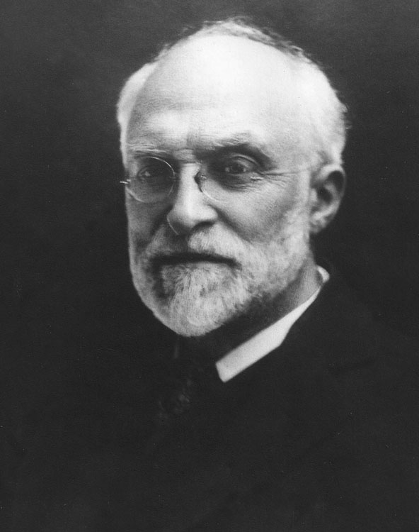
Samuel Crump (portrait courtesy of his great-granddaughter Patty Hoenigman)

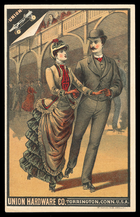
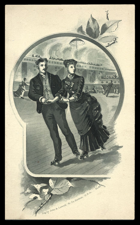
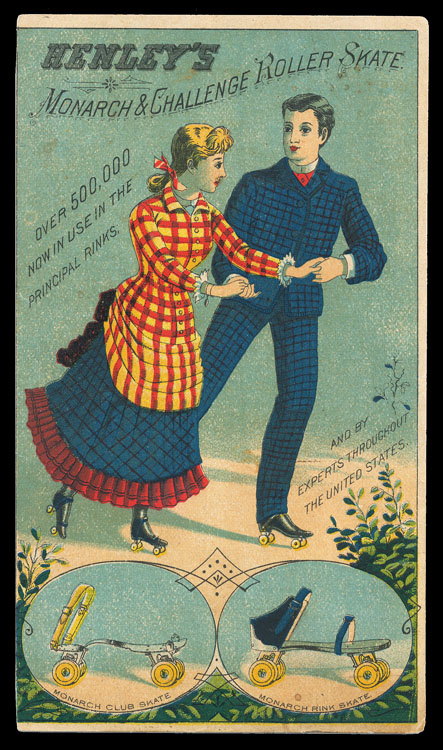
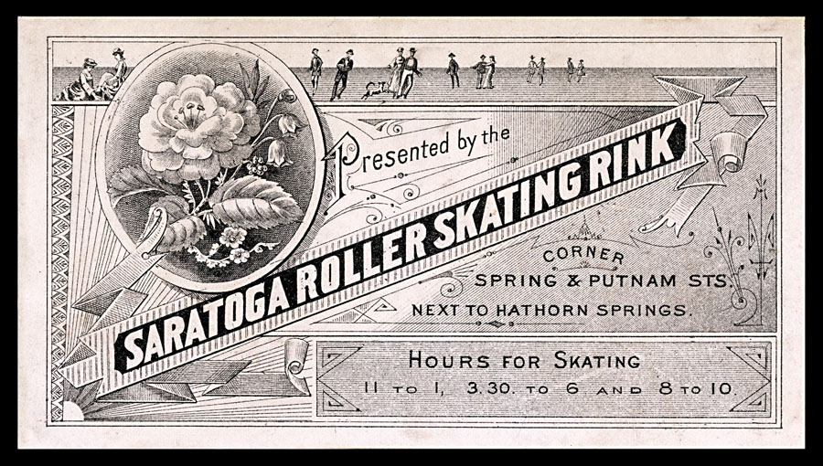
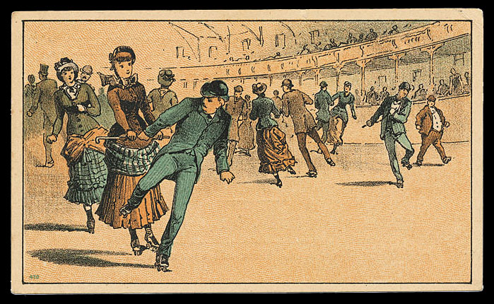
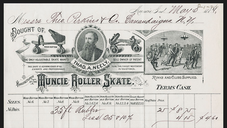
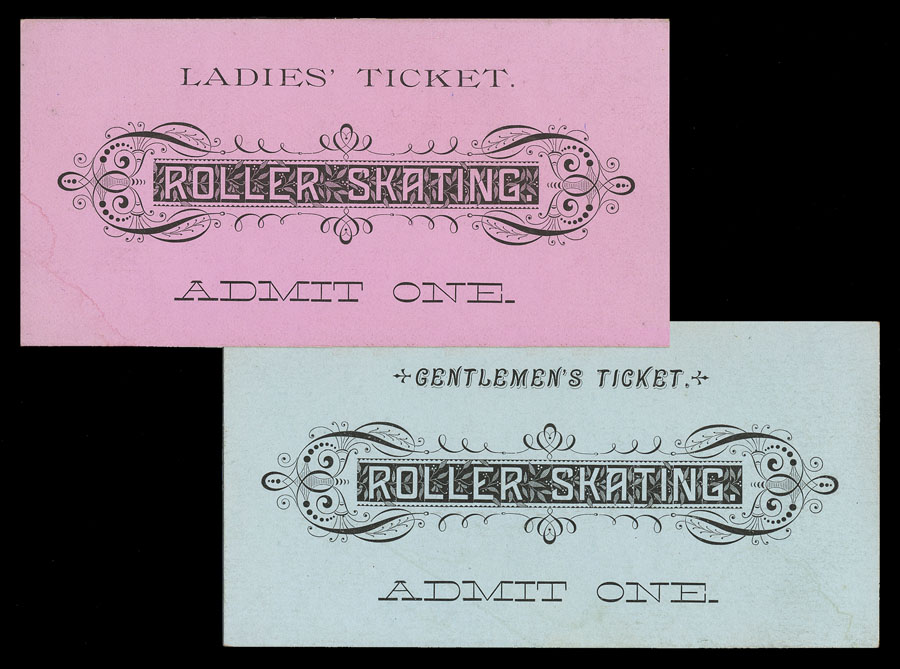
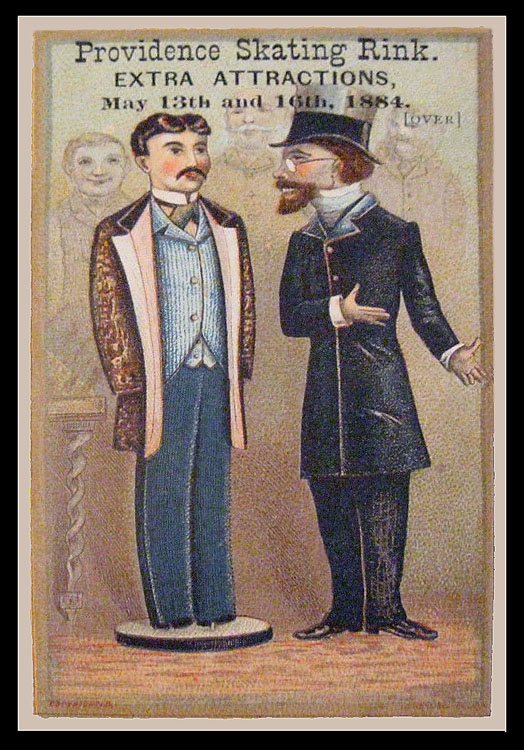
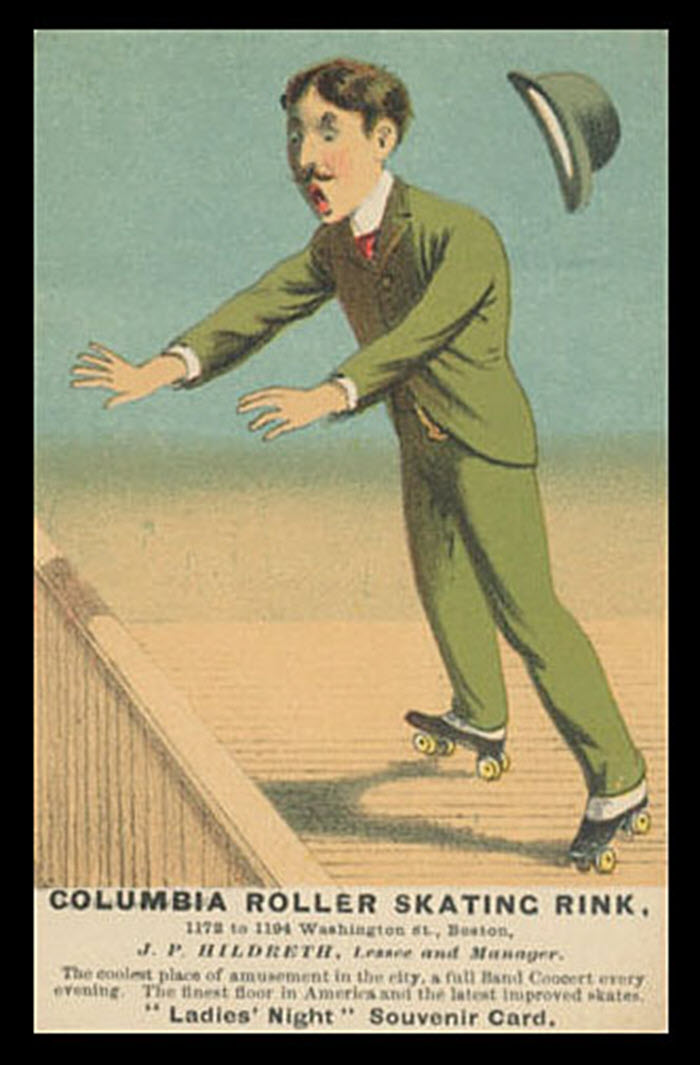
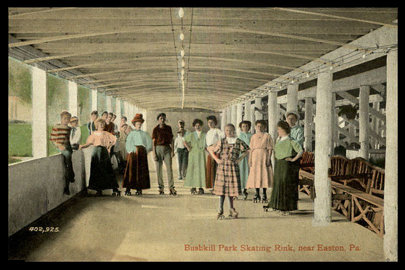
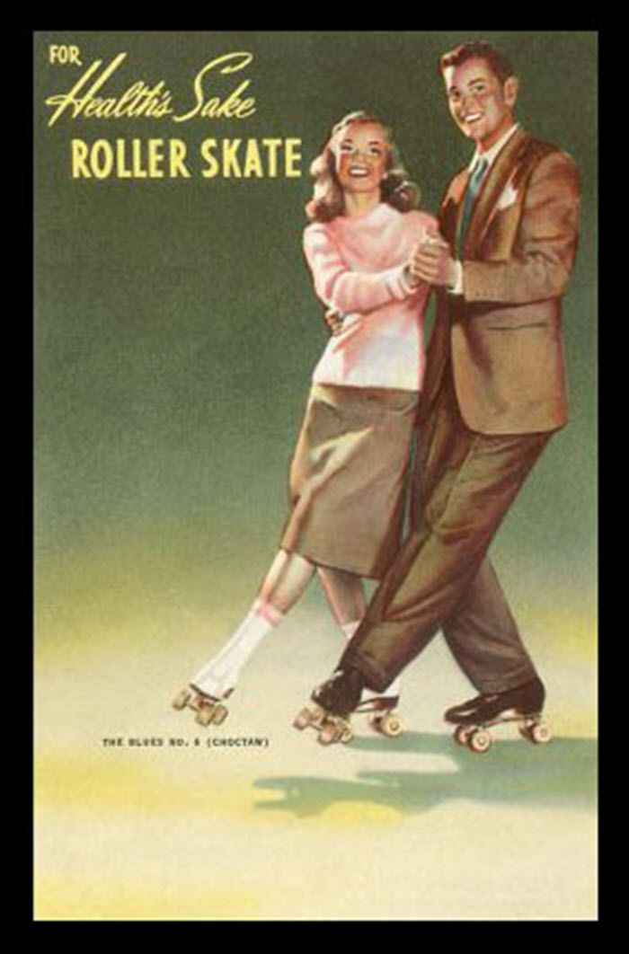
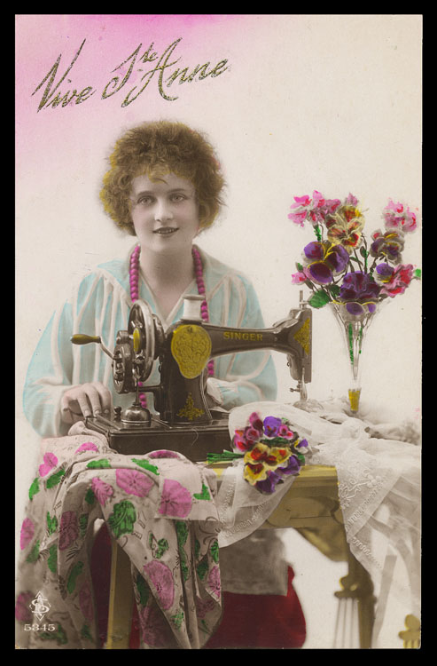
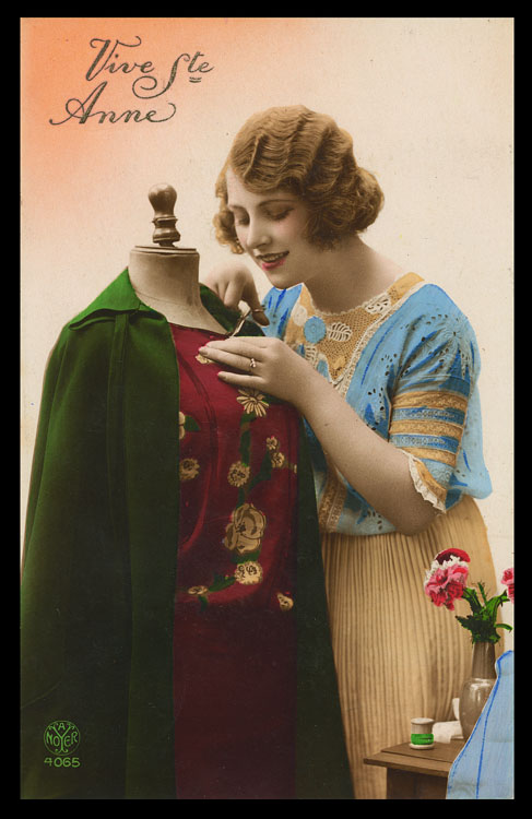
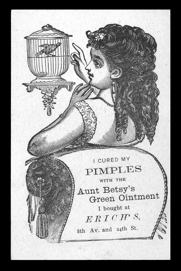
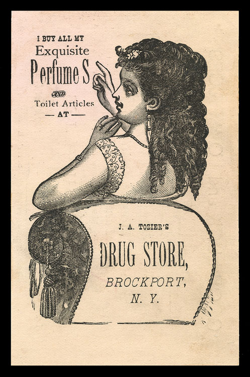
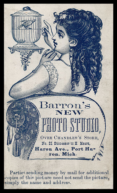
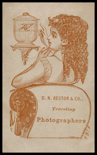
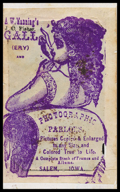
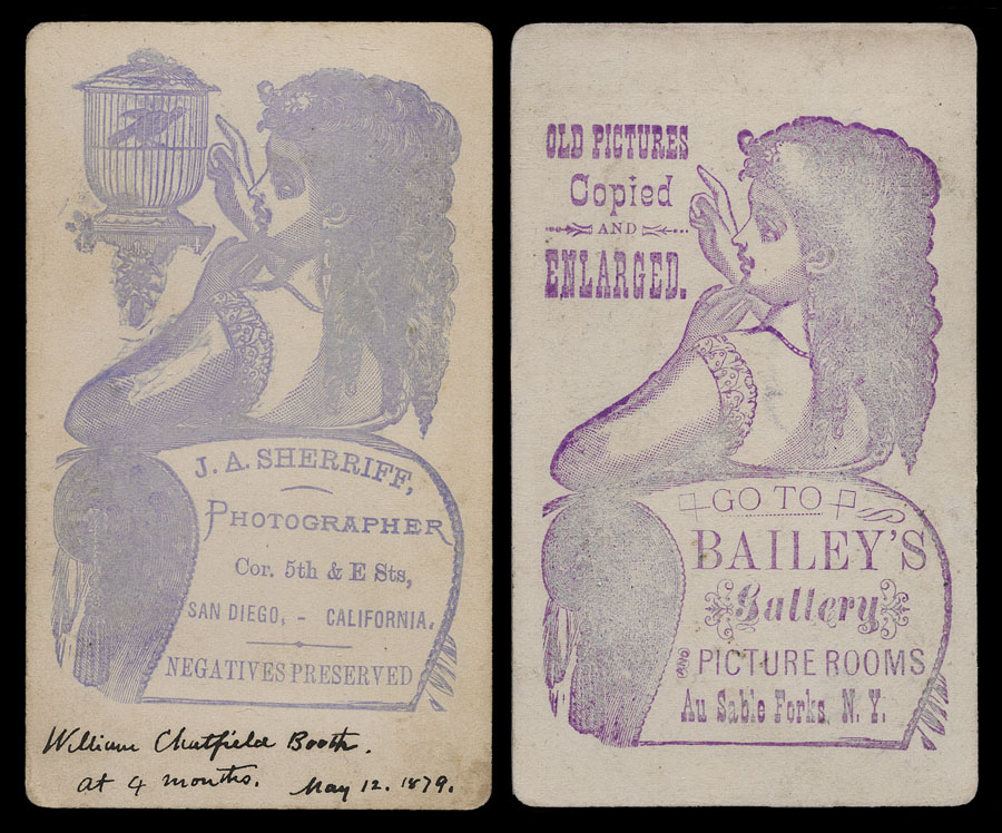
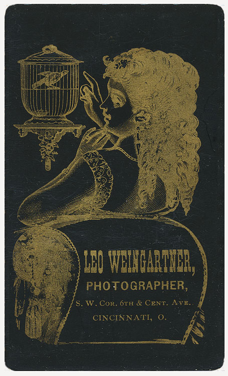
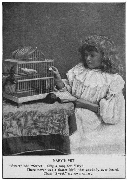
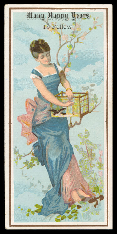
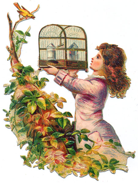
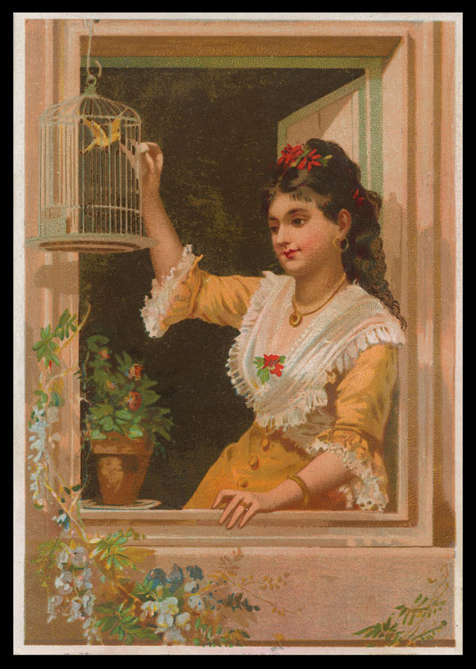
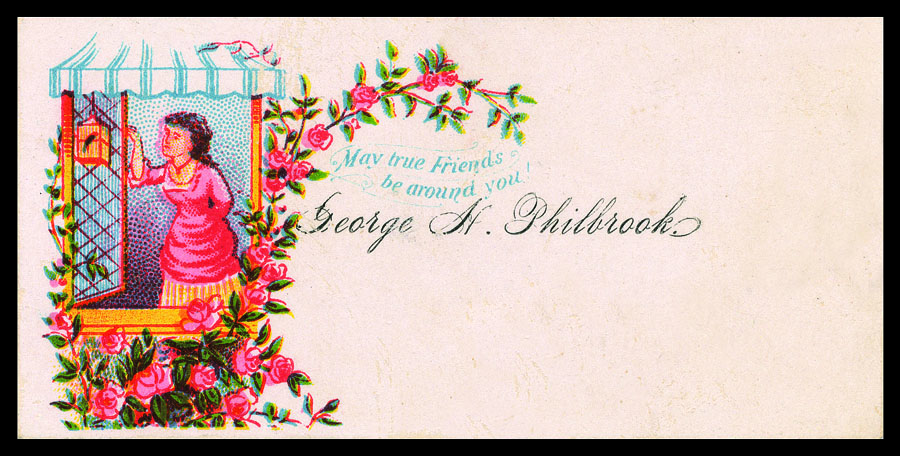
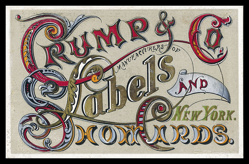
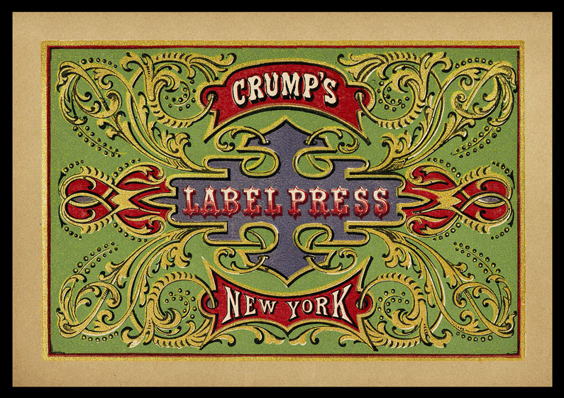
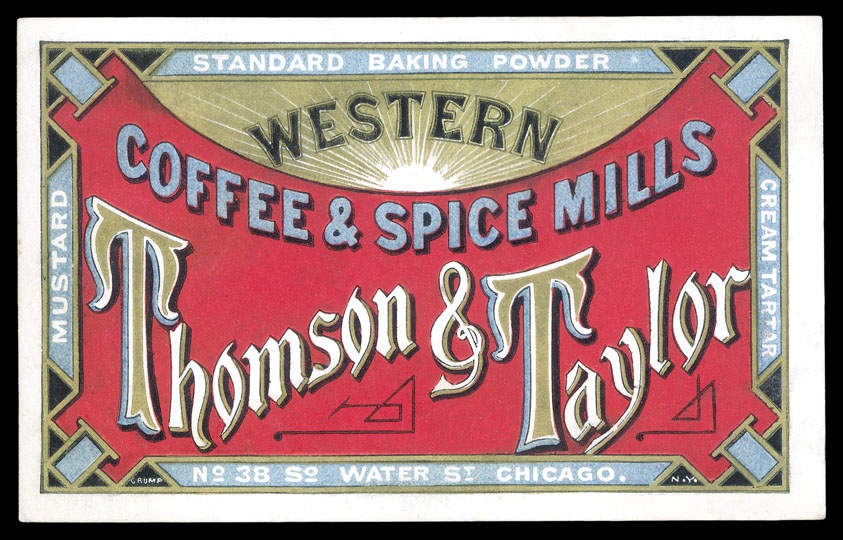
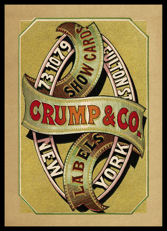
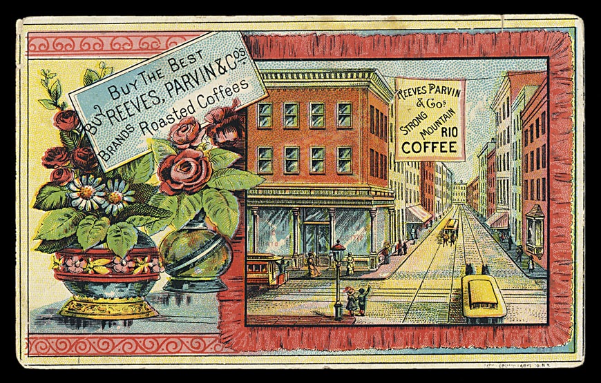
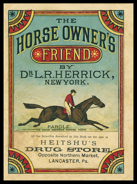
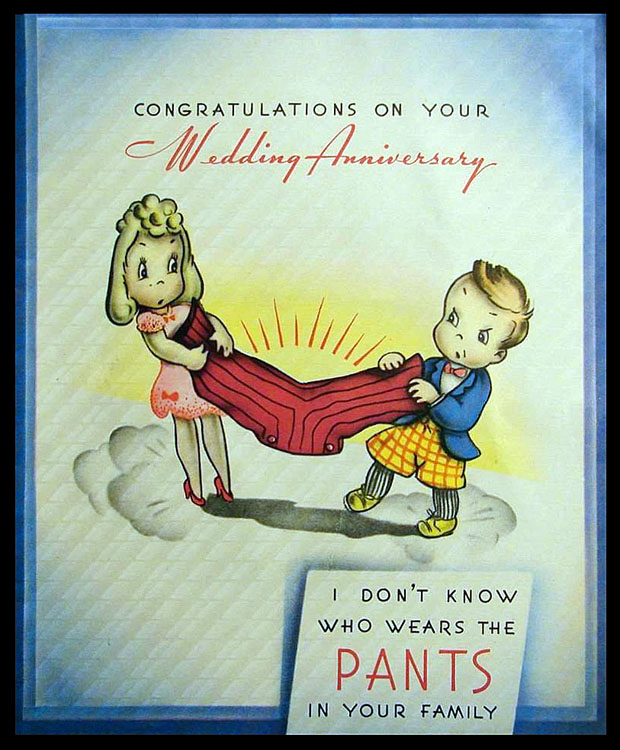
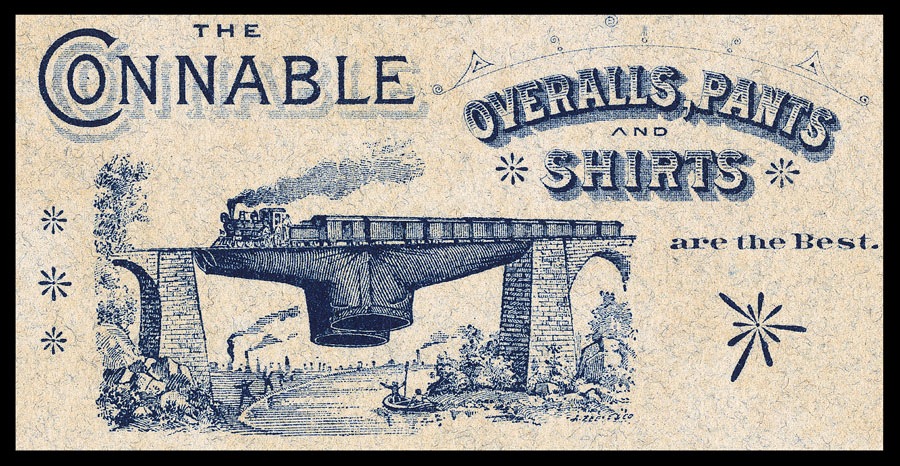
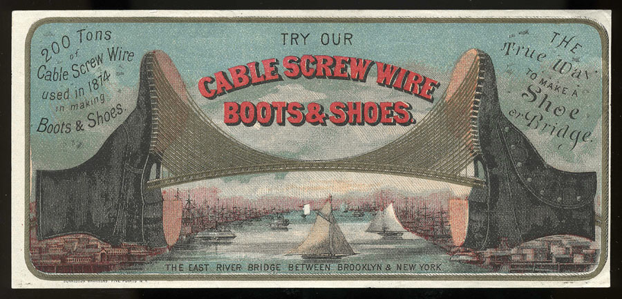
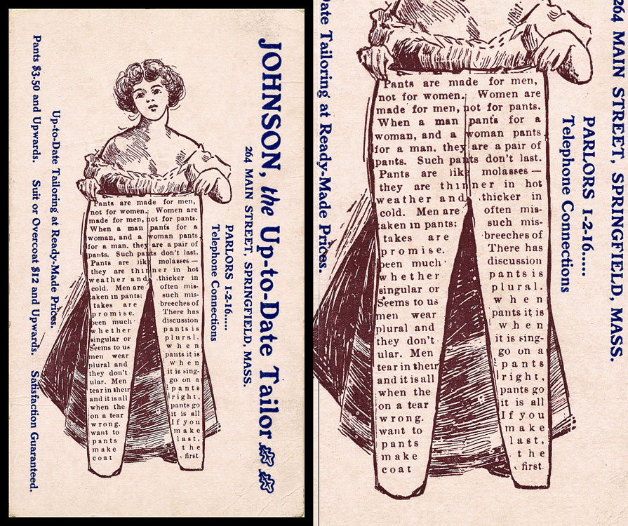
Many of today’s collections hold examples of trade cards and other items printed by Crump, and/or promotional materials for the Crump firm itself. I show a few examples of Crump pieces here, but my main reason for writing this short article is to present various interesting miscellaneous facts and anecdotes about Crump, a bit of the rich family lore. I have not fact-checked much of this, so simply pass it along for those who may have an interest.

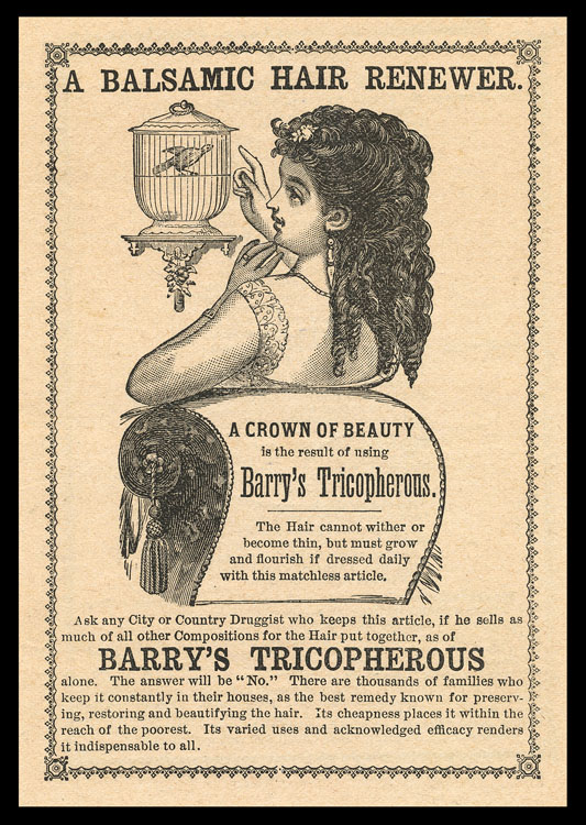
It is said that the elder Samuel Crump emigrated to the United States from Wales and that he put together a printing press for a Brooklyn, NY newspaper before going into business on his own. By the Victorian era, Crump Label was printing one million labels per day! In 1881 alone, the firm shipped over 200 million labels, despite an ongoing economic depression.

The Crump operation became entirely self-sufficient on-site, manufacturing its own paper and inks and furnishing its own power. It employed some 190 skilled workmen. One contemporary description states that Crump labels “are printed in from one to ten colors inclusive, and present an attractive appearance. The higher grades are given a fine gloss or glaze, which greatly enhances their beauty. In fact, they surpass, in merit of design and beauty of finish, many chromos occupying places on the walls of some American homes.” (Industries of New Jersey, Part V, Historical Publishing Company, 1882)

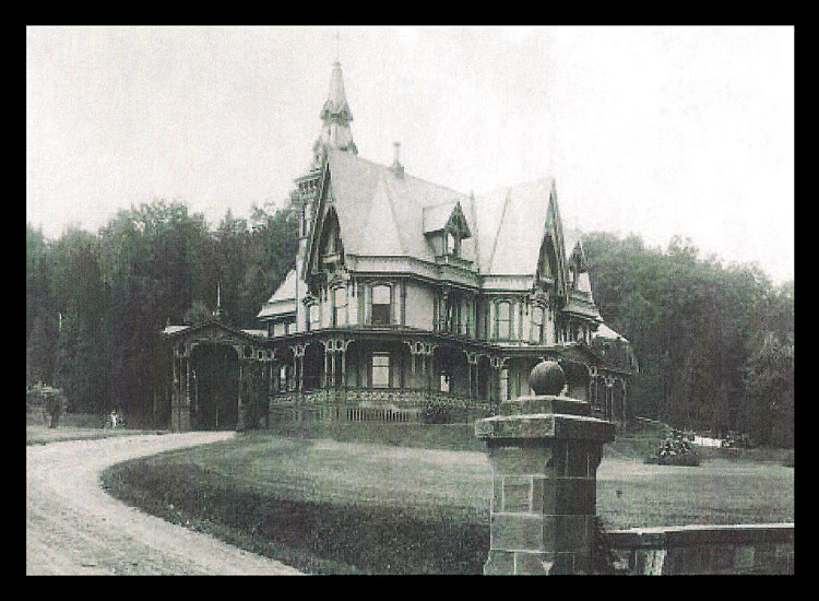
As his success grew, Samuel the younger built an exceptional gingerbread Victorian house and home in Montclair, NJ. The family—Crump, his pregnant wife Anna and four children—moved in in 1875. The Crumps eventually had 12 children, six of whom died young, another was killed fighting in WWI.

The Crump house in Montclair, NJ

Interestingly, in 1880 Crump hired a professional sanitary engineer to thoroughly inspect their house to try to identify the source of an outbreak of diphtheria. I have a copy of the report submitted by that engineer, Charles F. Wingate, which goes into fine detail about the site, the land’s pre-existing uses, the Crump cesspool septic system, and its vents, etc. He concluded that the house’s systems were fine, but that kitchen slop and other vegetable and animal matter simply tossed outside on the ground, as was commonplace in the day, might well have been a factor in causing diphtheria.

Crump had a number of eccentricities. It is said that he hung his blankets from the ceiling so that they would not touch him, sometimes wore suits made of paper, drilled holes in the tops of his shoes to admit air. After trips to the Far East, Hawaii and Australia Crump became so interested in coconuts that he set up an operation to can and distribute coconut meat, but that something went wrong and his canned products often exploded. Late in life, he attempted to create a water-based newspaper ink that would not rub off.

Family lore has it that Crump at some point sold the business, moved out West, then returned to New York after losing all his money. He died in Shanghai, China while visiting a daughter who lived there.

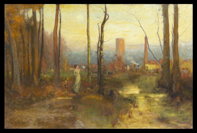
George Inness, The Mill Stream, Montclair, New Jersey, c1888. Inness moved to Montclair in 1878. In the background of this painting appears the Crump factory complex. “Far from making a statement on the negative aspects of industrial encroachment, Inness used the factory to portray the “civilized landscape” in which vistas of nature are enhanced by signs of mankind’s progress. The artist bent all his artistic powers to support this theory, uniting composition, color, light, and mood to infuse into his industrial landscape a lyricism that echoes the idyllic pastoral landscapes of Claude Lorrain.” (Minneapolis Institute of Arts)

Stretching the Truth

Exaggeration abounded in mid-to-late-nineteenth century imagery, for comic effect and/or to emphasize product features. One oft-repeated graphic, in numerous variations, showed a pair of pants resisting mighty efforts to pull it apart. This may have originated with Levi Strauss, who used that visual to sell its new, tough canvas denim jeans, which the company created originally with California gold miners in mind.

Below are a few more . . . if any readers have others, I will be happy to add them to this post (send images/scans, of decent resolution, to dicksheaff@gmail.com).

(Image courtesy of ESA Board member Glenn Mason)

There were also other exaggeration images demonstrating the toughness of a pair of pants:

And there were images featuring other sorts of stretching:

Finally, having nothing to do with stretching (other than stretching the borders of corniness), here is another pants-related piece of printed ephemera, from the early 20th century . . .

Split Fountain Printing

Split fountain printing is a time-honored technique for printing in two or several colors in one pass. It was a way to have more colorful pieces without the expense of full color. Modern printing presses have ink trays, or “fountains”, situated above the press sheet. Rollers below then spread the ink evenly across the width of the job. To print split fountain, multi-color in one pass using just one ink tray, the operator carefully places the different colored inks next to each other in the tray, and as the job runs all of the colors appear, bleeding into each other somewhat where they border.

The principle was basically the same in times past (and now) with other printing processes . . . letterpress, lithography, silkscreen or even steel engraving (though I’m not sure I’ve ever seen the technique on steel or copperplate engraving, but imagine that it likely has been proposed or used as a security measure). However the job was physically inked, the different colors were arranged to be touching each other for printing in one impression. (Note: printing several non-touching inks in one pass, differential inking, is also done, but that is another subject.)

This reward of merit shows an early baseball game scene on the left. According to Al Malpa, a partial uncut sheet bears the imprint at the bottom of printer Bassett, Church Street, New Haven.

Split fountain technique was sometimes used within type characters . . .

Specimen advertisement in a promotional book out by the Baltimore Sun in1876. The type examples were to demonstrate the capabilities of their Chromatic Press, which is discussed at some length in the text. It was a split fountain arrangement, which printed this page in three abutting colors in one impression. Below is a woodcut of that printing plant.

The Crump Label promotional piece below, interestingly, shows faux split fountain printing: looks like split fountain but is not.

Split fountain printing has been used in all sorts of ways.

The psychedelic poster designers of the 1960’s reveled in split fountain.

And nowadays it pops up in all sorts of places . . .