
Tag: Richard Sheaff

Write on, Brother!

One aspect of collecting manuscript material and/or postal history is the challenge of deciphering vintage handwriting. But there is also the occasional joy of coming across handwriting that is eye-catching . . . sometimes because of its elegance, sometimes because of it’s unusual and quirky nature, sometimes because it is nearly inscrutable.

Here are some examples.

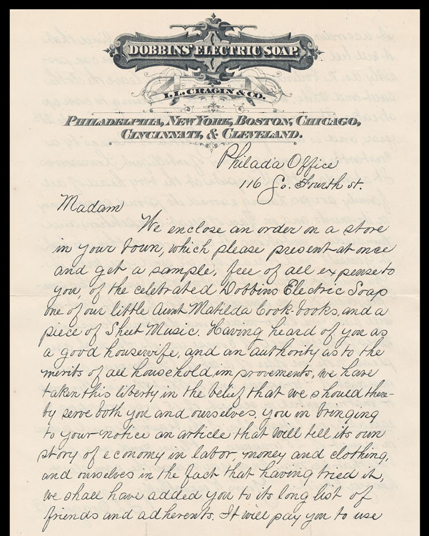
Dobbins’ElectricSoap150This one reminds me of the Palmer Method handwriting (though Palmer is more precise than this example) which those of us of a certain age all learned and practiced in grade school. (And no can no longer do because the skill has atrophied from disuse.) “The Palmer Method of penmanship instruction was developed and promoted by Austin Palmer in the late 19th and early 20th centuries. It was largely created as a simplified style of the “Spencerian Method”, which had been the major standardized system of handwriting since the 1840s. The Palmer Method soon became the most popular handwriting system in the United States.” (Wikipedia)

Somewhere around here, I have some Palmer Method practice books, which I’ll find and add to this post sometime soon.

The Dobbins’ Electric Soap promotional letter is printed by lithography from a handwritten original.

Went looking, first came upon a writing practice book for a different system than Palmer’s, the Duntonian (1873 edition of a writing book first issued in 1870) . . .

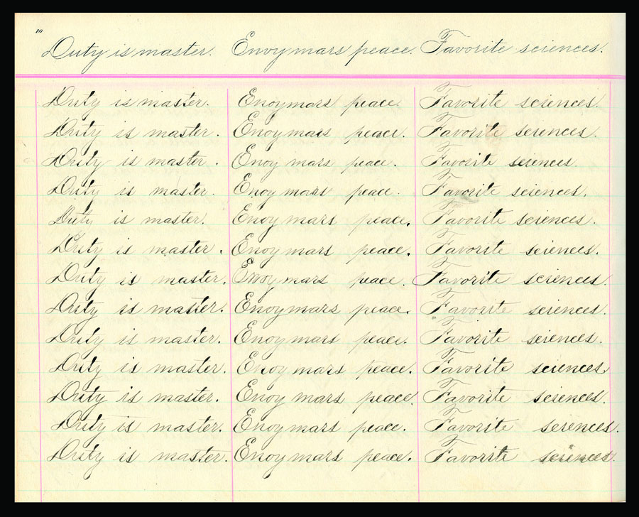
Difficult to read, but wonderful to look at.

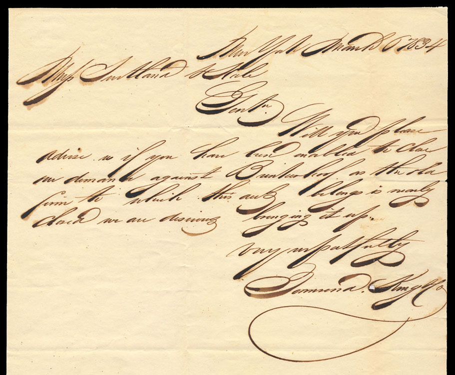
I once knew whose wonderfully unreadable signature this is, but do not now remember and cannot decipher . . . anybody out there who can help?

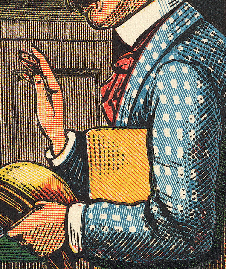
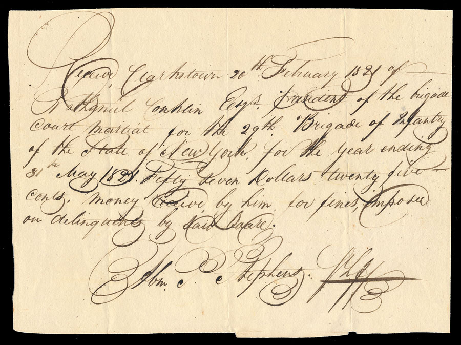
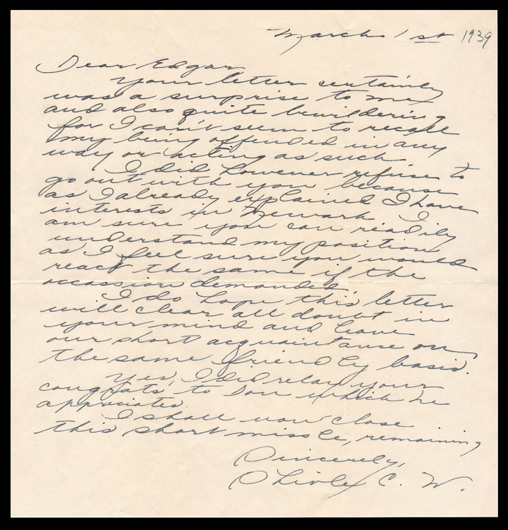
Left-handed, and quirky all around.
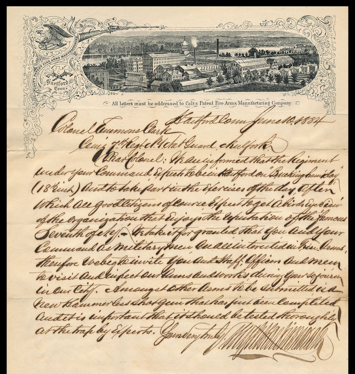
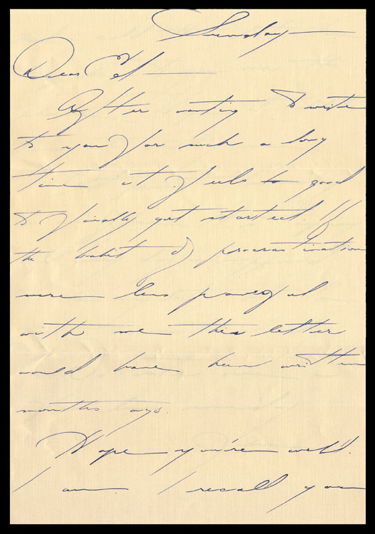
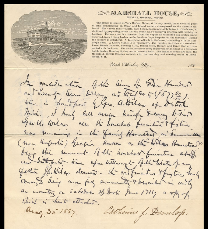
Tres elegante.

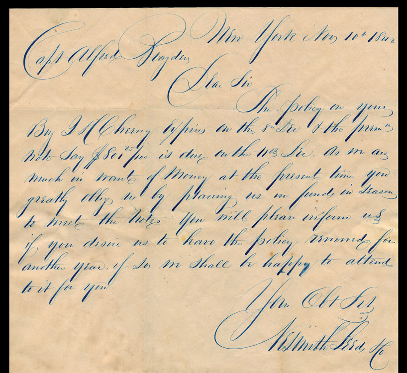
Swash, swash, swash.

This is a several-page letter, whose writer (letterer, really) put in an enormous amount of meticulous handwork. The things we do in the name of love.

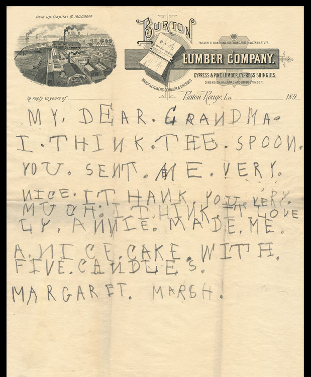
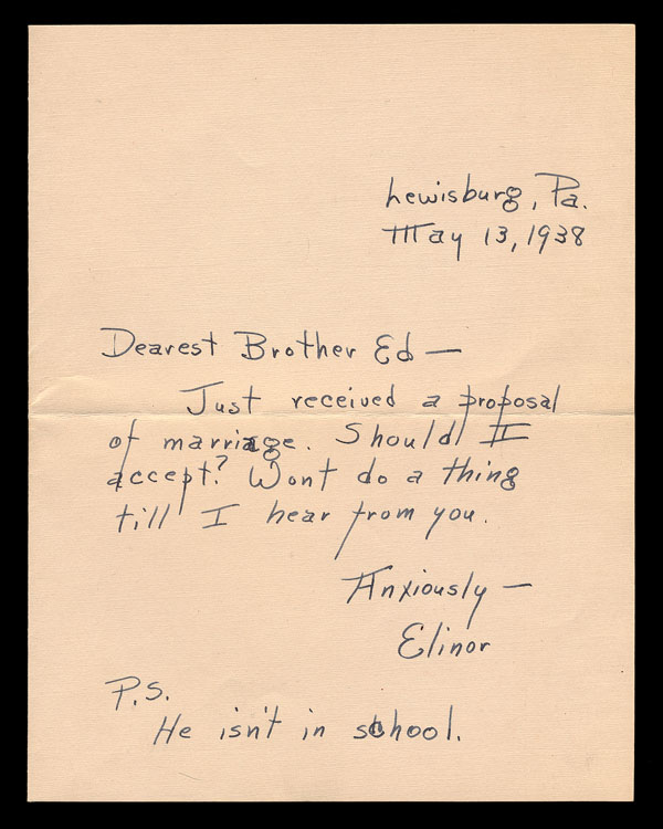
The early attempts of kids are often engaging.

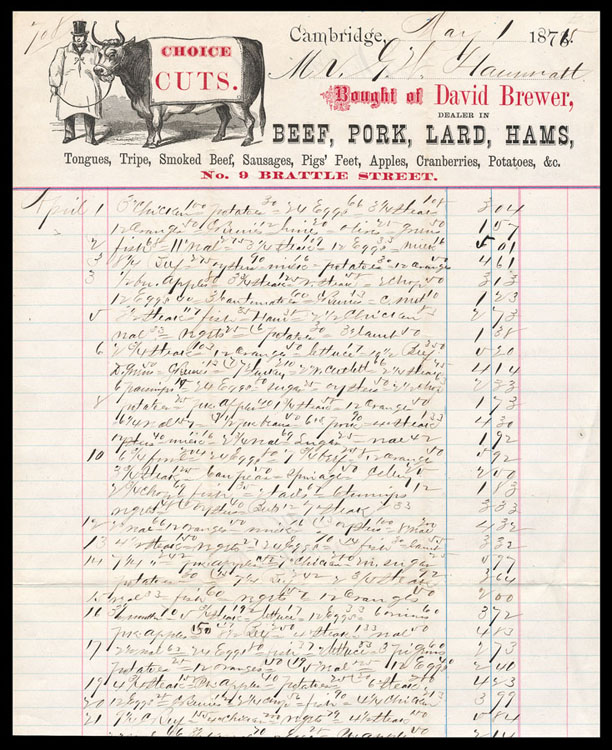
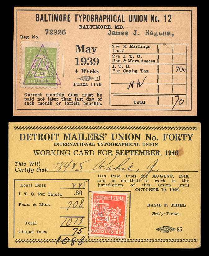
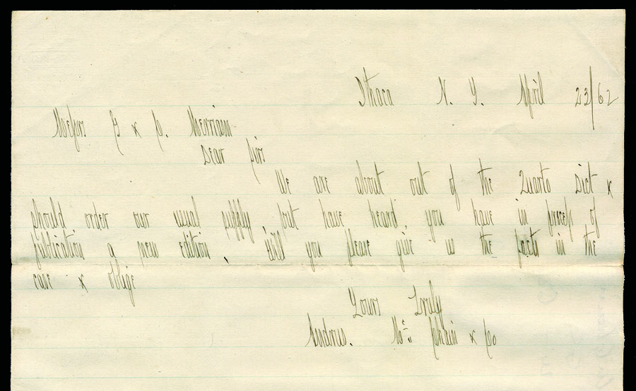
The individual purchases listed are pretty hard to make out, but overall it creates an unintended, sort of pleasing texture/pattern.

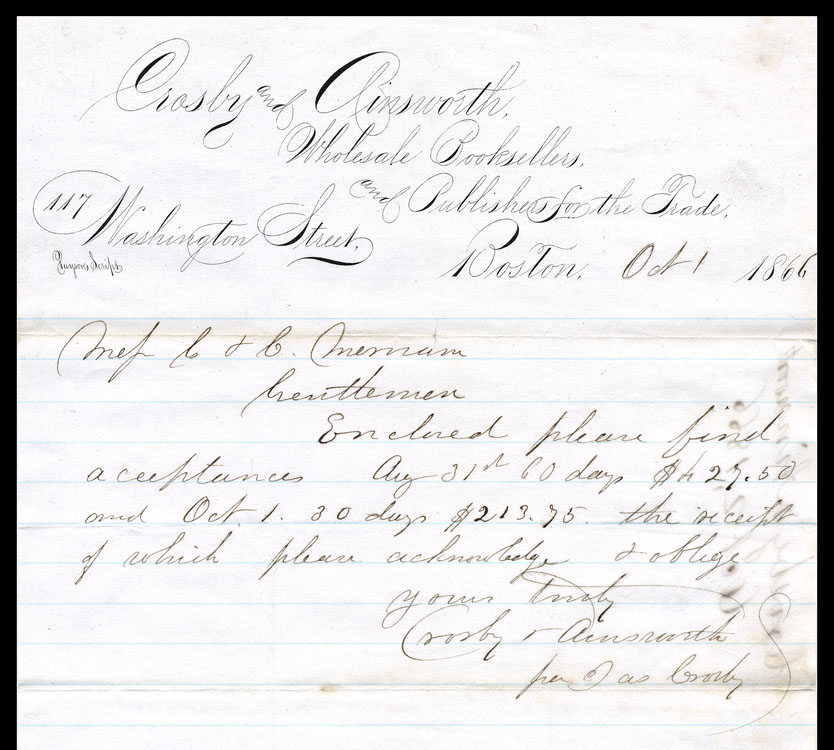
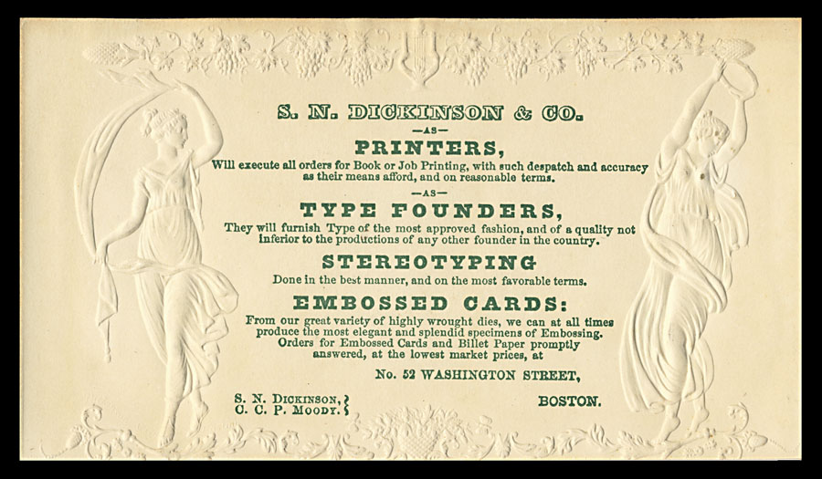
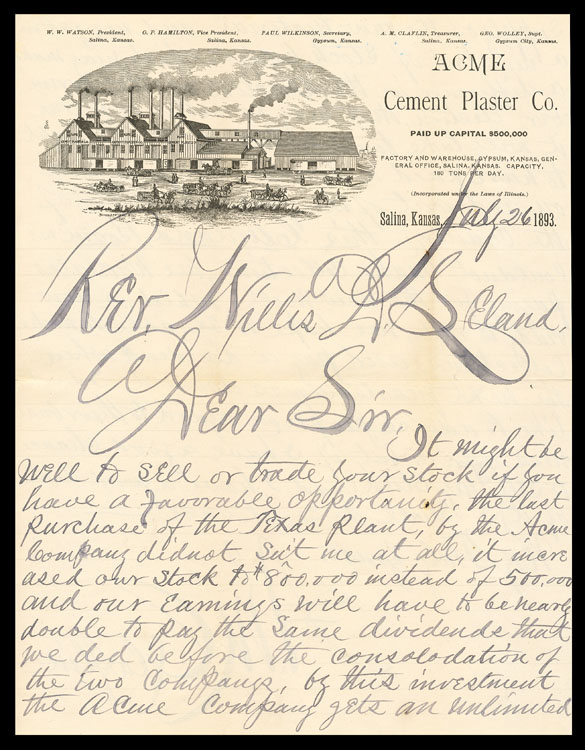
In the lower-left, this letterhead’s printed text is credited to “Payson’s Script”. I do not exactly what is going on here: perhaps Payson personally rendered it on a litho stone?

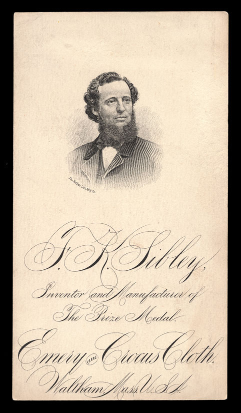
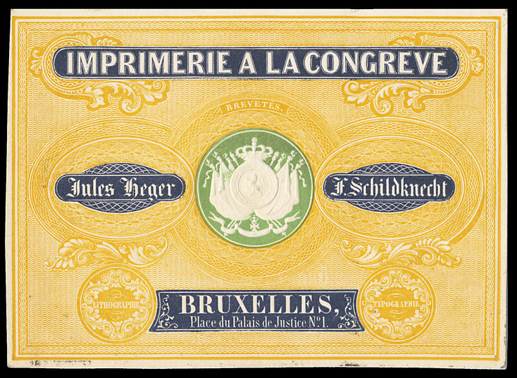
A similar example, printed by lithography.

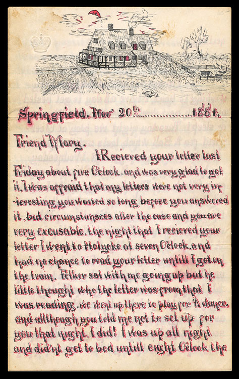
Cross-writing, sometimes in a contrasting color, was commonly used when a writer ran out of available space but wished to say more. This particular 1883 letter has interesting content, including a description of a visit to a circus, where Jumbo was on display (passage above): As for Jumbo, I have no words to express the hideousness of the mighty beast, more huge in size than I ever imagined living flesh and blood could grow.

1883 was the year of completion of the Brooklyn bridge. Barnum offered to have Jumbo walk across to demonstrate the bridge’s strength, but his offer was declined.

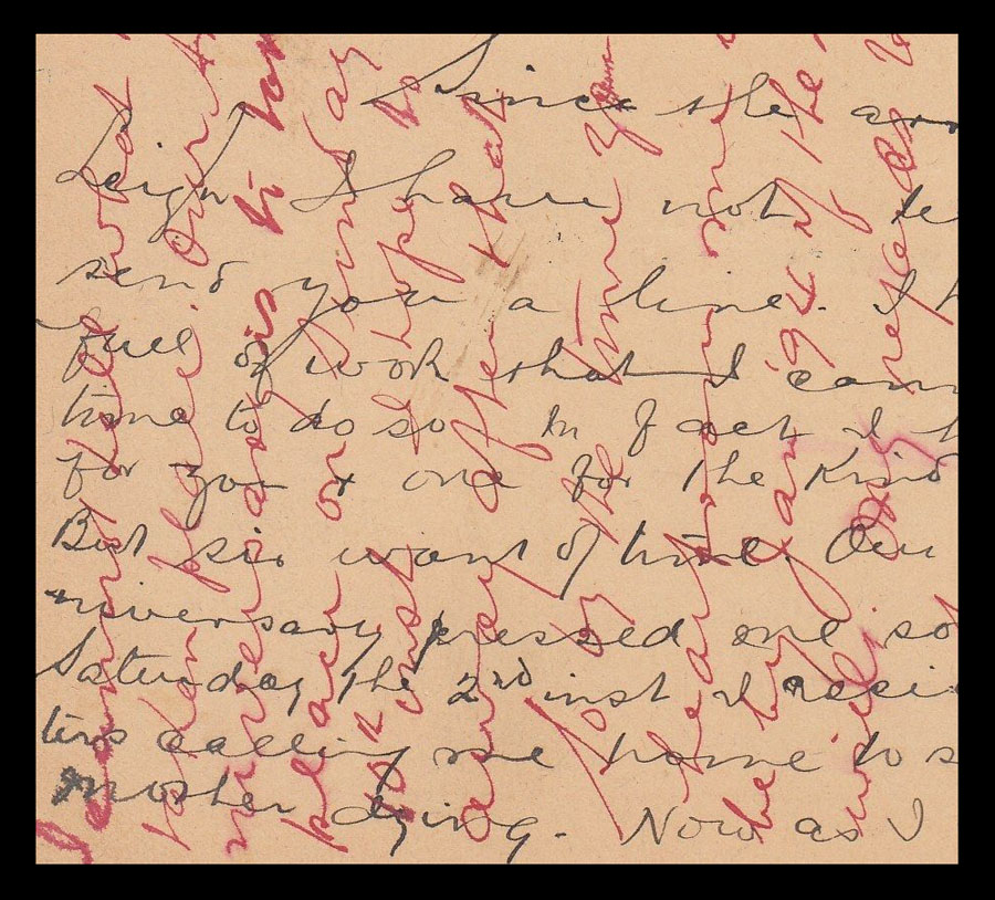
Cross writing in two colors of ink.

Other Times, Other Places

One of the primary attractions of ephemera is that we are given glimpses into the way we were. Here are a few examples.

A card distributed by agents of the circus, almost a half-century ago now, to alert potential customers of upcoming dates and places . . .

No app for this, in those days . . .

An interesting card that sheds a bit of light on early telephone etiquette. Evidently this card, with it’s a suggestion about how best to answer the telephone, was given with a new phone at installation . . .

Telephone rates in Lincoln, Nebraska in 1948 . . .

Before flying in commercial aircraft went from exciting to dreadful, travel by train was exciting (before it became dreadful) . . . trans-continental Domeliners, Speedliners, elegant dining car service . . .

Below is the center spread from an early 20th-century booklet promoting the healthful properties of processed sugar. Here it reads, “Give the whole family a treat and surprise them with a Candy Pulling party . . . The principal ingredient is just Cane Sugar with utmost food value and absolute purity. The young folks will all go home full of good things, and with no ill effects from their indulgence.”

World War II vintage Army humor . . .

An elaborate Eastertime advertising promotion by a printer, back when Easter was widely and publicly celebrated, the promo hidden in the egg. Copy on the back of the yellow disk urges the recipient to “Hatch out a good brood of profits” by using the company’s services.

Peacock feathers picked up not plucked, one would hope, as a souvenir of an 1894 European Grand Tour . . .

In 1945, mechanical time clocks kept track of time-in and time-out in all sorts of places . . .

A 1960’s anti-war decal . . .

Once upon a time, there was a centuries-old craft, that of the typesetter. In the late 1980s, virtually overnight and through no fault of their own, all those craftsmen lost their jobs, as their companies went out of business, inadvertent victims of the personal computer revolution . . .

Ah, the endless difficulties of dealing with the teenage brain. Notice at the bottom:

NO CHILDREN NO ADULTS”. Guess that leaves only teens. I’ll bet they didn’t discuss sexting . . .

January 1, a good day to hop on the wagon!

Horse-drawn commercial delivery wagons are an interesting subject and a rich topical collecting area. Vintage delivery wagons (as well as many other types of wagons, carriages, carts, horsecars, coaches, and drays) can be collected as trade cards, advertising covers, industry periodicals, trade catalogs, postcards, chromolithographic prints and/or photographs.

Work vehicles were first produced in the Massachusetts Bay Colony in 1629. In 1676, there were twenty licensed “car men” in New York City. There are many historical trails one might follow . . . developing and evolving styles, suspensions, sizes, industries, specialized configurations.

Trade cards featuring just the delivery wagon shown large, and in color, are not common.

Trade Cards featuring Delivery Wagons - Criterion Soap

Conestoga wagons, familiar from wagon trails immigrating West, were originally developed as commercial wagons to haul freight in Pennsylvania.

Trade Cards featuring Delivery Wagons - Cudahy Bros. Packers

There exist a wealth of photographic imagery documenting 19rth century and early 20th-century commercial delivery wagons (this photograph is in the collection of the Library of Congress) . . .

Trade Cards featuring Delivery Wagons - American Laundry

Excellent renderings are to found in trade catalogs and industry periodicals (the first such in the United States was likely Coach-Maker’s Guide, Columbus, Ohio, 1853). Here is a particularly elegant vehicle from 1884 (The Carriage Monthly, Vol. 20, June 1884) . . .

This interesting globe novelty wagon (below) was created for the firm of McCabe, Young & Company of St. Louis in 1890; they had several of them about town. Soapine collectors will recognize this as very similar to one depicted on a Soapine trade card. I do not know if such a Soapine wagon actually existed or was only a promotional image inspired by real examples such as the Globe Shoe and Clothing Company . . .

A photographer’s advertising “backmark” (or backstamp or imprint) on the reverse of a carte de visite photograph mount . . .

William E. Clarke, the proprietor of the Hunt’s Remedy patent medicine, is standing in the doorway of his Providence storefront in this stereo view, with one of his wagons posed in front. Notice the dog sitting in the wagon . . .

A furniture hauling van, New York City . . .

. . . and a dye works wagon, Bloomington, Illinois . . .

This Alms & Doepke (Cincinnati) vehicle is not for product delivery; rather, it is to deliver customers to the store. It is a shuttle between various places in town, ending each loop at the store, but available to anyone wanting to go from any point to another along the route, for a 3¢ fare. A clever idea, a bit of a public service, and a way to have customers pay to come to the store!

This Emory Family Pills delivery wagon might or might not have actually existed . . .

I suspect that Remington delivery wagons likely did exist, as they appear in various company advertising . . .

Another sewing machine company . . . .

One little collecting passion of mine is anything and everything connected to the patent medicine maker Dr. Hardy, in the tiny town of Cornish Flat, New Hampshire. In my researches, I found a mention that Hardy’s brother operated a patent medicine wagon in Massachusetts made (almost) entirely of glass!! I am still looking for corroborating evidence . . .

Internal Engine Advertising Vehicles

Last week’s post was about 19th-century commercial delivery wagons; this week’s moves ahead in time a bit, to show some creative, motorized commercial advertising vehicles.

(These unattributed images were forwarded to me from somewhere on the web.)

Internal Engine Advertising Vehicles

Divers and Sundry

One of the most appealing things about collecting printed ephemera is that anything and everything can fall into your field of interest, that fascinating and unusual items can appear as if by magic in the most unlikely of places. Here are a few random odds and ends that caught my eye somewhere along the way . . .

I especially like items that incorporate actual white birch bark. Last week, at a local allegedly-antiques group mall I spotted this 1902 menu printed on birch bark in a $6 lot of miscellaneous paper . . .

It is uncommon for us, nowadays, to still be eating a packaged food that has remained unchanged for a century, but shredded wheat is one such. In my family, I learned to eat shredded wheat in a way that—I later learned as an adult—is apparently unusual: with hot milk, butter, salt and pepper. Yum.

Apparently this bride-to-perhaps-be was not exactly madly in love . . .

It strikes me that Roy Lichtenstein had nothing on this ca1880s wood engraver . . .

It is always a great surprise and pleasure to come upon some early piece in an unexpected place. I suspect that I may never see another of these cards with original metal, anthropomorphic bookmarks . . .

Ronald Reagan and other movie celebrities pushed tobacco cigarettes as a healthy medicine in full-page color ads back in the 1940s and 1950s; Dr. Perrin promoted cubeb smokes as medicine 100 years ago (cubeb is a plant found in Java and Sumatra) . . .

In 1914 this Indianapolis outfit promoted its radium treatments (with “U.S. Government certificates for all radium”) with an aluminum business card . . .

Undecided which color you prefer for your new ride? Choose all of the colors available that model year!

This advertising card for underwear came, unusually, with a miniature garment covering it . . .

I have a little side collection of 19th-century advertising which alludes to Darwin’s On the Origin of Species (first published in 1859) and his theory of evolution . . .

The first time I came across 19th century material promoting the “Piedmont Air Line”, I was taken aback . . . the Wright Brothers were still in knee pants! Turns out that this Piedmont Air Line” was a railroad line in Georgia which terminated at the summit of Mt. Airy, where this hotel was awaited . . .

Unusual Ephemera and Interesting Ephemera

Every once in awhile I come across an interesting temperance item that is a bit unusual in one way or another . . .

Unusual Ephemera and Interesting Ephemera

Post-WWII exuberance, which resulted in the whole raft of baby boomers (reverse of a business card for a tavern in Mississippi) . . .

Unusual Ephemera and Interesting Ephemera

The chosen typeface font for “WIRE WORKS” is just perfect for a firm that makes products made of wire . . .

Earth Times was a happening environmental publication on newsprint back in the heady days of the 1970s; this issue number 2 is dated a week or two after the first Earth Day . . .

Unusual Ephemera and Interesting Ephemera

Standing in Proud Relief

I have long been a fan of design which incorporates embossing. In my own graphic design work, I often included a blind-embossed element. Strong embossing requires the making of a male die and a female die, in perfect alignment; for each impression, one sheet of paper or cardstock is compressed between the two dies under great pressure.

Successful work requires fine craftsmanship, selection of a paper stock which can survive the pressure without the tearing of fibers, and careful registration. Generally, any color printing on the item was/is completed before the embossing step, which means that the successful completion of the print run ends up in the hands of the embosser, who must do his work in perfect registration to any inks already laid down.

Embossing is done under great pressure, in all senses of the word.

Examples of embossing can be found across a wide range of printed ephemera . . . valentines, invitations, dance cards, trade cards, letterheads, postcards, book covers, labels, greeting cards, postage stamps.

Here is small sampling . . .

Ephemera - Design which Incorporates Embossing

Junk Mail Is Nothing New

The mid- to late-nineteenth-century saw the beginnings of advertising agencies (most, at first, simply placing newspaper ads for their clients), of compiled mailing lists and pre-printed labels . . . and of junk mail fishing for fresh, new contacts. For a variety of reasons, the first junk mail (targeted mail, generic mail . . . take your pick) went to and through local postmasters. Small town postmasters knew anybody and everybody in town, knew their businesses, knew their interests, knew their foibles. Much such mail was addressed directly to the postmaster, asking him to pass it along to someone in town likely to be interested in the product. Other mail, addressed to “The Leading (Teacher / Grocer / Doctor / you name it)” in town also bore a side note to the postmaster asking him to re-direct it to somebody else likely to be interested, if appropriate.

Postmasters in those days were allowed to send and receive Post Office business mail for free; many a PM took advantage by engaging in some other occupation on the side using the free mail privilege. Not really kosher, but Washington largely looked the other way. Knowing this, some early junk mailers made it clear on the outer envelope that the PM was welcome to sign up as a local company agent and do some business with and for them.

I’ve been on the lookout for such envelopes for a decade or two, planning a long article or perhaps a book one day. (Like many of us, I have a long list of maybe-someday projects, few of which will likely ever see the light of day. The real fun of collecting is, as they say, in the search.) Here are but a few such covers, which demonstrate a range of the approaches taken by the junk mailers of the day, some legitimate firms simply exploring the possibilities of direct mail, others seemingly hucksters through and through.

This one more or less orders the postmaster around . . .

Imagine The postal inspectors’ or TSA’s reaction to a cover addressed in this fashion today! . . .

An ambulance chaser, of sorts . . .

Instructs the postmaster that if two such envelopes arrive, please hand to two different teachers . . .

These folks were a bit less particular . . . just “give it to someone.”

An unused envelope with pre-printed generic address . . .

A mailed folder . . .

Ephemera and Junk Mail | Ephemera Society of America

Even the Chinese got into the act! . . .

Ephemera and Junk Mail | Ephemera Society of America

Dartmouth Winter Carnival Posters

Dartmouth’s annual Winter Carnival has been a major celebration since 1911. It is a long weekend filled with ski competitions, hockey games, a dogsled race, ski jumping (in years past), skating, parties, ice sculptures, receptions, talks . . . all sorts of events. I once met (twice) and talked with Johnny Cash when an episode of the show “Hootenanny” was filmed here, one Winter Carnival many moons ago.

Each year a new Winter Carnival poster is created. A detailed discussion of the subject can be found at: http://dartmouthalumnimagazine.com/articles/carnival-art

These Dartmouth Winter Carnival posters offer a special retrospective of 20th-century graphic design. Posters, like clothing, can offer a sense of a time and a place. They can be indicators of cultural history.