
Author: Tamar Zimmerman

Fire! Victorian Advertisers Capitalize on Danger

Nineteenth-century advertisers had no need to sensationalize the dangers of fire; its threat was ever-present. Homes were heated and meals cooked on wood, coal and gas-fueled stoves. In the evening, families gathered by the light of oil or gas-burning lamps, portable versions of which were carried upstairs to light the family to bed.

In cities, a fire could spread rapidly through adjacent buildings, particularly wooden ones. Massive fires that destroyed landmarks, entire blocks, and even neighborhoods were not uncommon. These conflagrations caused huge economic and personal loss.

Famous Fires

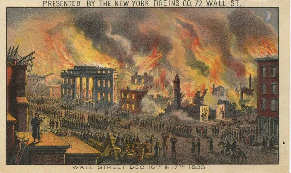
The “Great Fire” of 1835 started in a warehouse and went on to destroy nearly 700 buildings in New York City, leveling Wall Street completely. The City had only a volunteer fire fighting force at the time and the fire died out only when it reached the East River. In the aftermath, 23 of the city’s 26 insurance companies went out of business. The New York Fire Insurance Company, chartered in 1832, must have been one of the ones that survived. This 1880s-era trade card illustrates the disaster and includes the firm’s founding date on the reverse. Perhaps that was all the recommendation needed.

Ephemera - Fire! Victorian Advertisers Capitalize on Danger

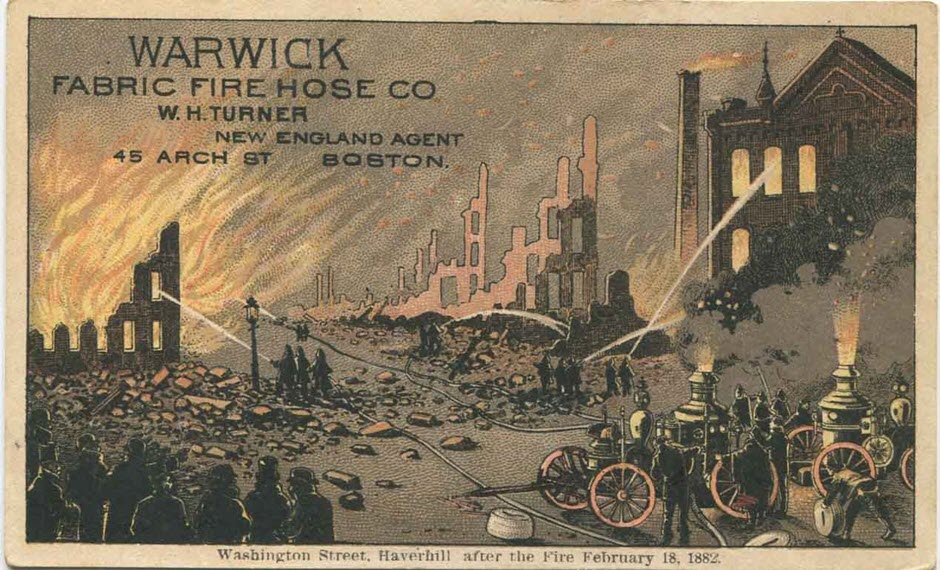
In 1882, a fire destroyed 82 shoe and leather firms in the town of Haverhill, Massachusetts, putting more than 2,000 people out of work. Early responders might have been more successful at halting the fire had one of their hoses not burst. The Warwick Fabric Fire Hose Company used a dramatic image of firefighters dousing the last of the flames amidst the ruins of Washington Street to advertise “The Most Perfect Fire Hose Yet Invented.”

Ephemera - Fire! Victorian Advertisers Capitalize on Danger

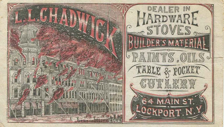
The Hodge Opera House was the “Pride of Lockport”, NY when it was built in 1871. Ten years later, it burnt to the ground. L. L. Chadwick, an enterprising purveyor of builder’s materials and home goods used the image of the burning opera house to advertise that he had everything needed to furnish a new (or re-built!) home.

Ephemera - Fire! Victorian Advertisers Capitalize on Danger

Means of Escape

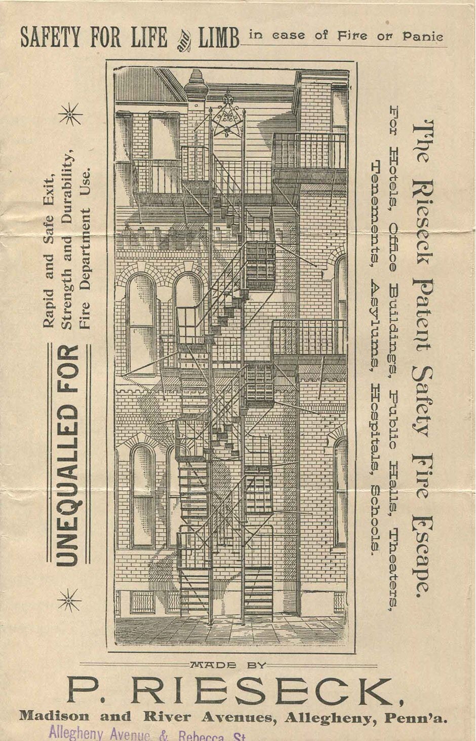
On June 3, 1885, Pennsylvania adopted a Fire Escape Law, mandating a “permanent, safe external means of escape” from all buildings over three stories in height. Structural Ironworkers, P. Reisdick, published the full text of that law and its supplement in this 1890s/1910s folder advertising their Patent Safety Fire Escape.

Ephemera - Fire! Victorian Advertisers Capitalize on Danger

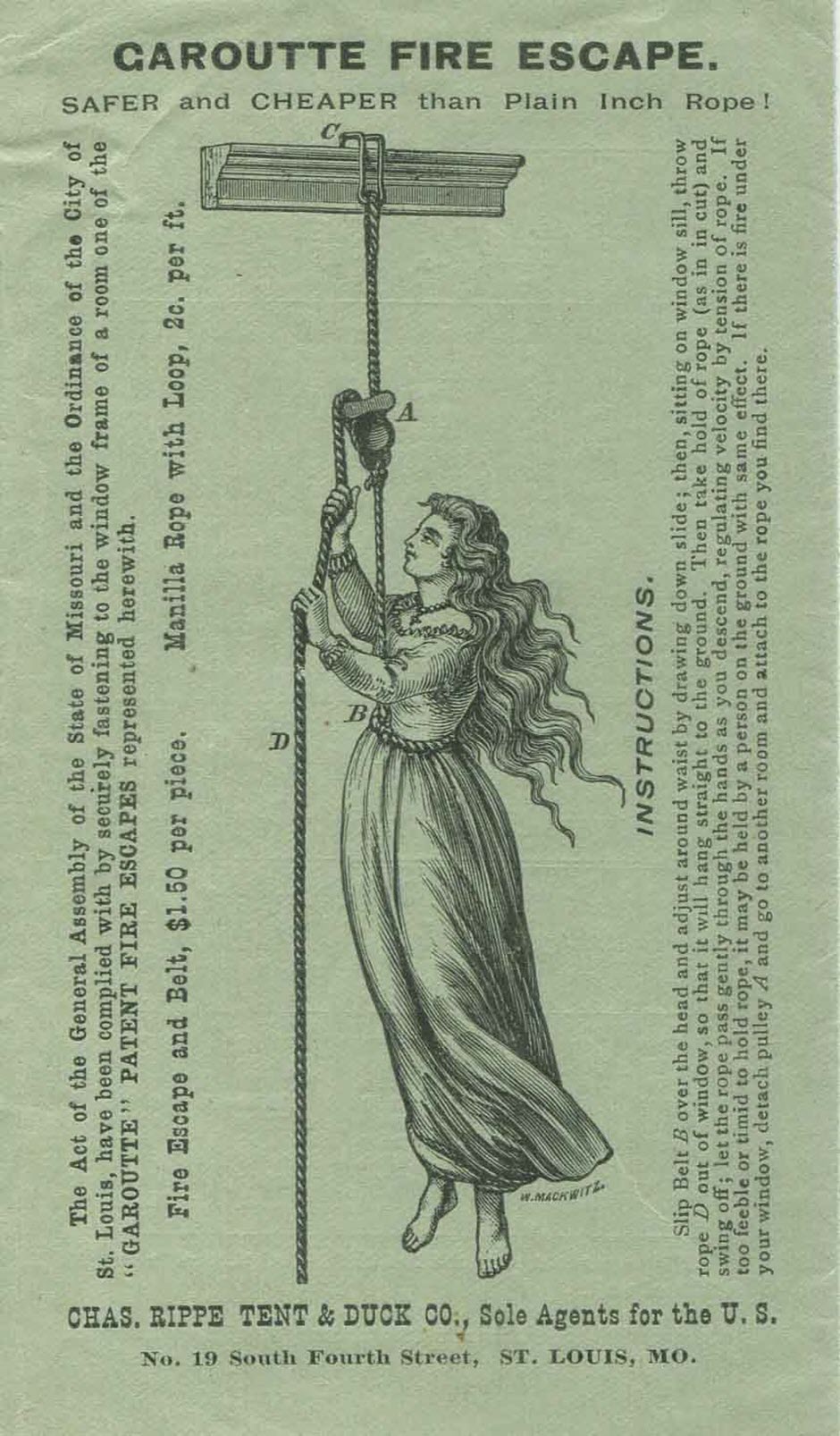
The Garoutte Fire Escape supposedly complies with a St. Louis, Missouri fire ordinance. It is at least “safer and cheaper than plain inch rope.” The instructions advise, “If there is fire under your window, detach pulley A and go to another room…” Sage advice.

Ephemera - Fire! Victorian Advertisers Capitalize on Danger

Protecting Yourself and your Property

Nineteenth-century innovators developed a number of products that deterred fire or touted fire-protective properties.

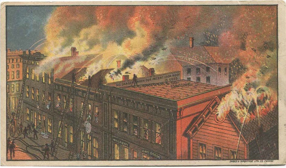
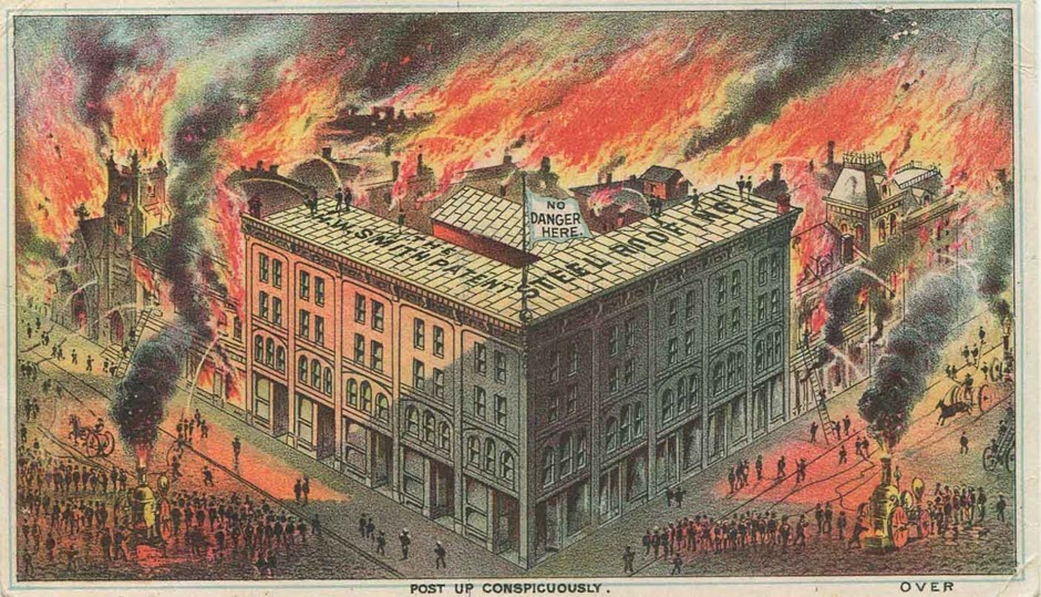
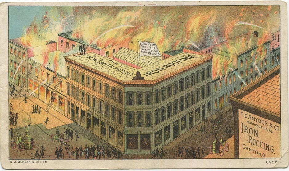
Steel or Iron Roofing was advertised as “fire-proof.” It was an enormous improvement over wood roofing and was adopted widely in the latter 19th century. W.H.T.C. Snyder & Co. issued a series of dramatic trade cards showing urban conflagrations; buildings with the Smith Patent Iron or Steel Roof remain un-touched while flames engulf the rest of the block.

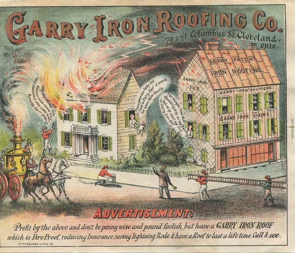
The Garry Iron Roof Co. fabricated roofing, siding, and shutters made of iron. The occupant of the house sheathed in those materials isn’t worried about burning shingles hitting his home, while the firefighter operating the hose complains that he could have had four hours more sleep if the house on the left had been covered with Garry’s Iron Roofing. All this while the unfortunate mother is compelled to toss her baby out the window!

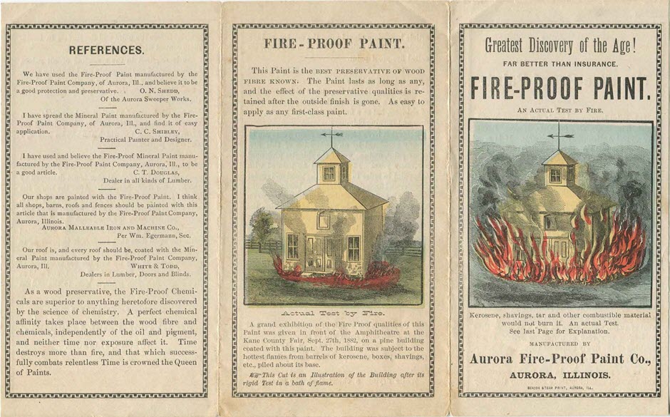
In this flier, the Aurora Fire-Proof Paint Company calls their product, “the greatest discovery of the age!” and “far better than insurance.” It is composed of “the best linseed oil and metallic bodies by an improved chemical process which renders it impervious to fire…” Fire-retardant paints and coatings are available today. Most of us are familiar with the foam-like finish of intumescent paint on structural steel. Today’s paints are categorized as “fire-retardant” or “fire-resistant” – never, “fire-proof.” It is unclear how Aurora’s paint actually performed, but the inclusion of “metallic bodies” must have been intended to mimic the protective qualities of the iron roof. The “Actual Test by Fire,” said to have taken place at the Kane County Fair on September 27th, 1882 is illustrated with a beautiful wood engraving showing the pine building sitting un-touched on a bed of flames. The cover image illustrates the dramatic alternative.

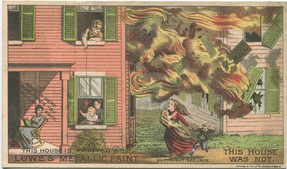
The mother and children fleeing their burning house for the neighbor whose house is coated with Lowe’s Metallic Paint are assured that she will be safe there, despite the flames licking the side of the house. Notice the children playing at the windows and the lady of the house calmly rocking on her porch.

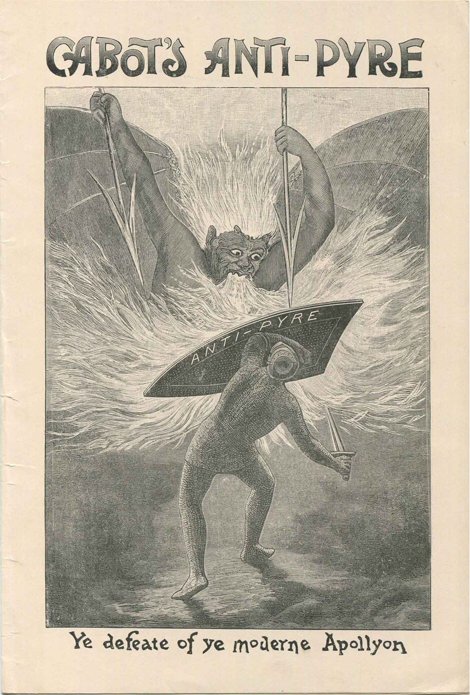
This folder for Cabot’s Anti-pyre takes an allegorical approach. Their product defeats the “modern Apollyon,” or “Destroyer” – Fire, embodied by a winged demon with flaming hair and breath. The product is a liquid fire-proofing and “the first and only protection against fire that is cheap.”

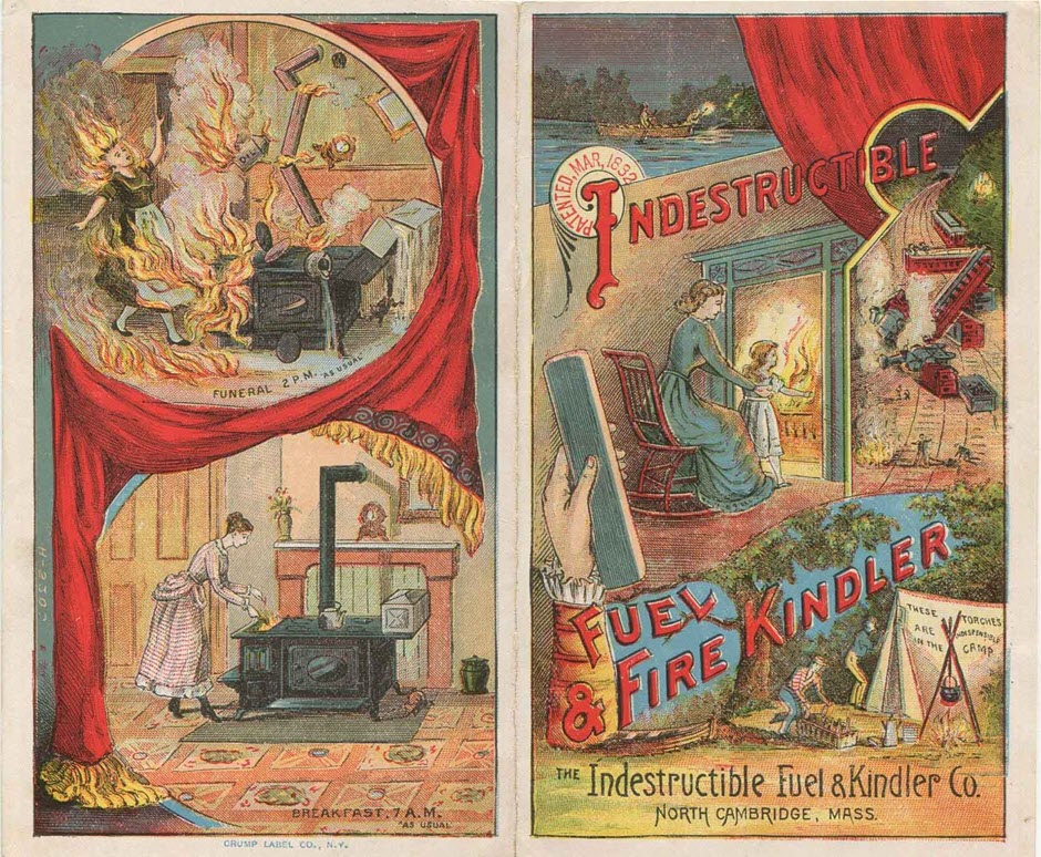
One of the most dangerous moments in keeping one’s grate, stove or lamp going was when lighting the fire. Highly combustible kerosene oil could burst into flame suddenly with disastrous results. Advertisers showed little restraint in illustrating these accidents. In a terrifying two panels, the Indestructible Fuel & Fire Kindler Co. shows how the use of their product will yield “Breakfast 7 AM as usual” while the flaming alternative results in “Funeral 2 PM as usual.”

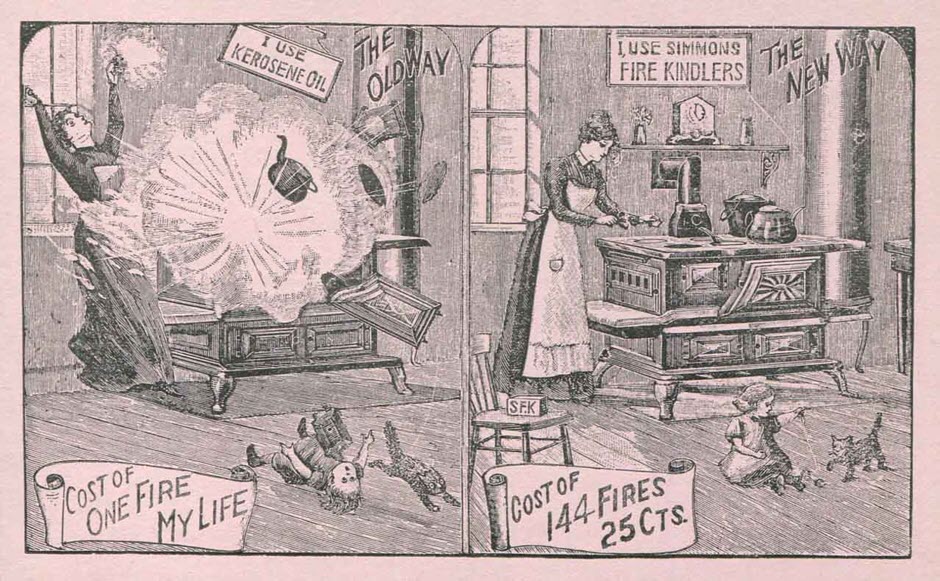
This trade card for Simmons Fire Kindlers adds a child playing in the kitchen for additional drama and compares the cost of one fire with the cost of 144 kindlers. Who can argue with spending 25 cents for fire kindlers to spare the life of a mother?

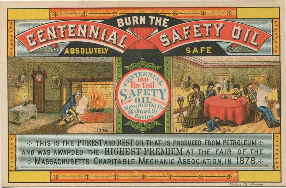
Some oil companies sought to improve their image for home use. This brand of petroleum oil has the word “safety” in its name. Nothing on this card explains exactly what makes Centennial Safety Oil “absolutely safe.”

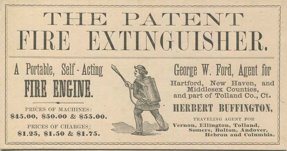
With some home fires inevitable, fighting the fire was the next step. The Patent Fire Extinguisher worn on the back is described as “A Portable, Self-Acting Fire Engine.”

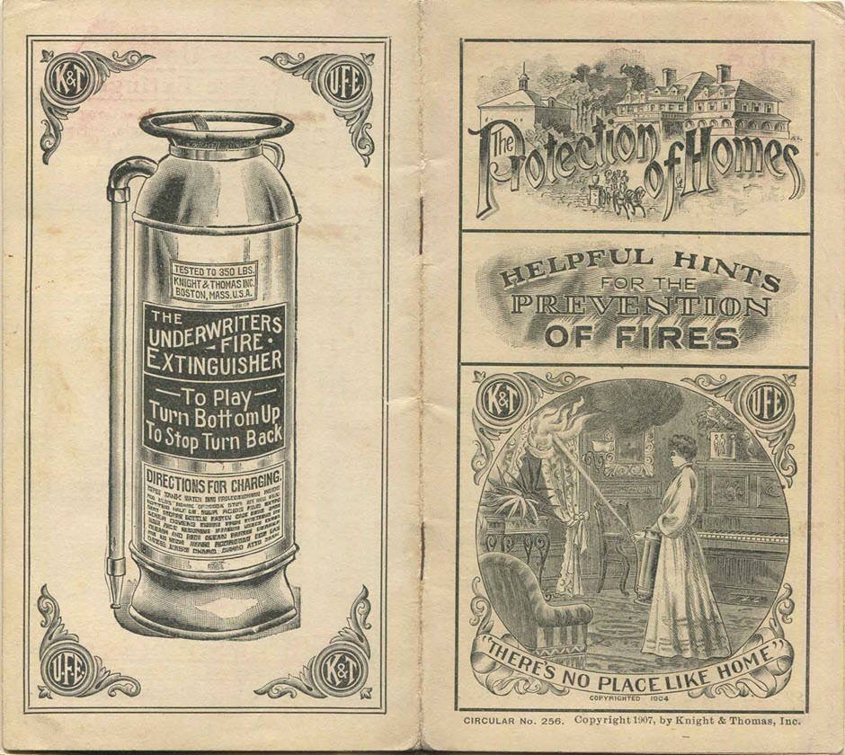
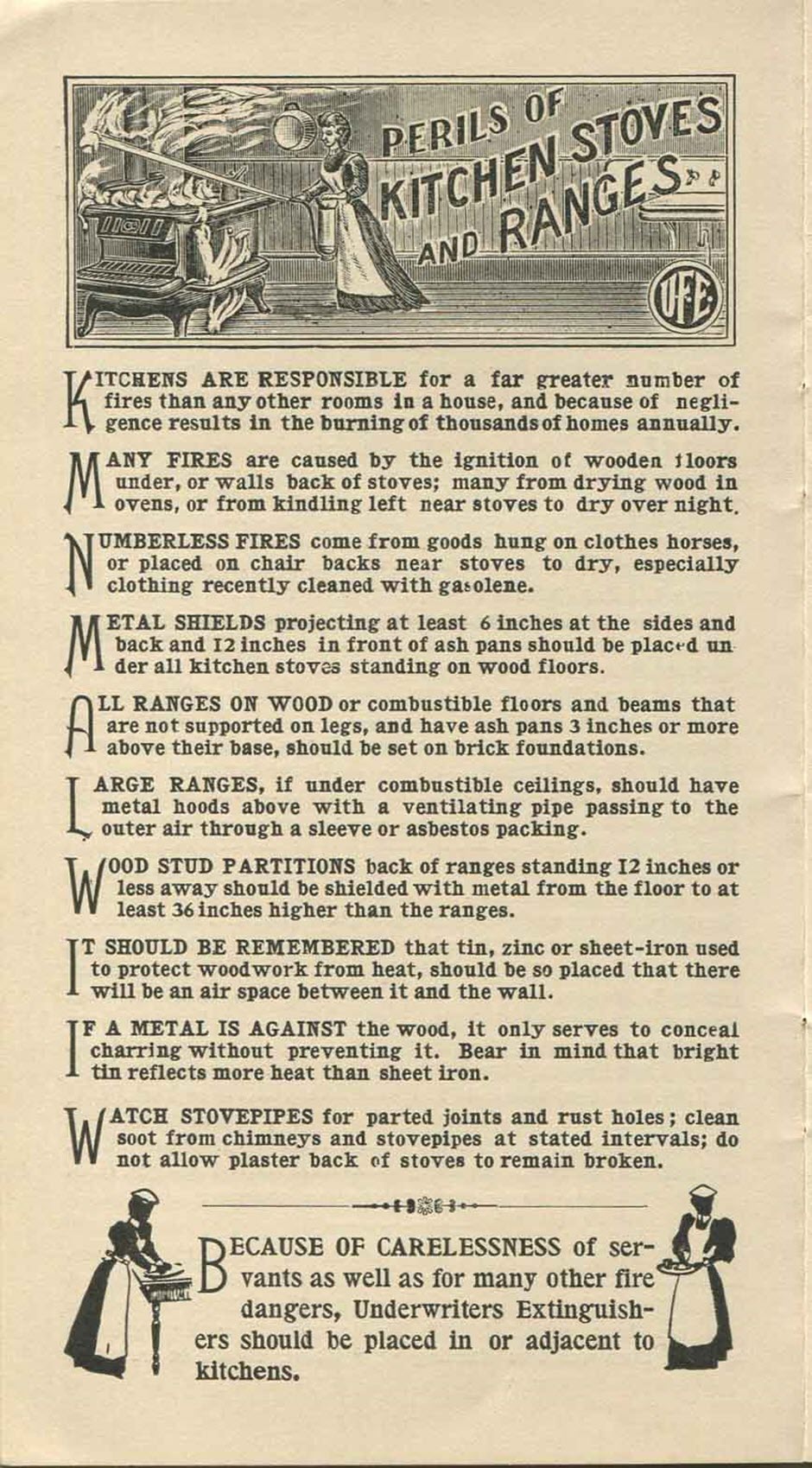
Knight & Thomas, maker of the Underwriter Fire Extinguisher, put out this booklet of “Helpful Hints for the Prevention of Fires” in the first decade of the 20th century. It lists a host of dangers including furnaces, chimney flues, lamps, gas stoves, and Christmas trees. An interior illustration shows a cook using the fire extinguisher on a burning stove. “Because of the carelessness of servants,” the company recommends keeping a fire extinguisher in or adjacent to kitchens. On the cover, the lady of the house calmly douses the drapes.

If the fire was out of control, it was time to hook up a hose – and probably summon the fire department. Hose manufacturers also exploited potential customers’ fears to sell their products.

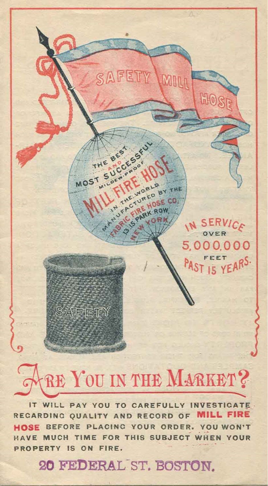
Fabricators of the Safety Mill Hose warned those in the market to thoroughly investigate their product as “you won’t have much time for this subject when your property is on fire.”

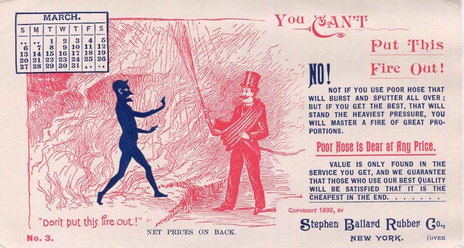
The Stephen Ballard Rubber Co. knows that you can’t put a fire out “if you use a poor hose that will burst and sputter all over,” but the demon protecting this fire is no match for their hose, wielded by a dashing gentleman in a top hat.

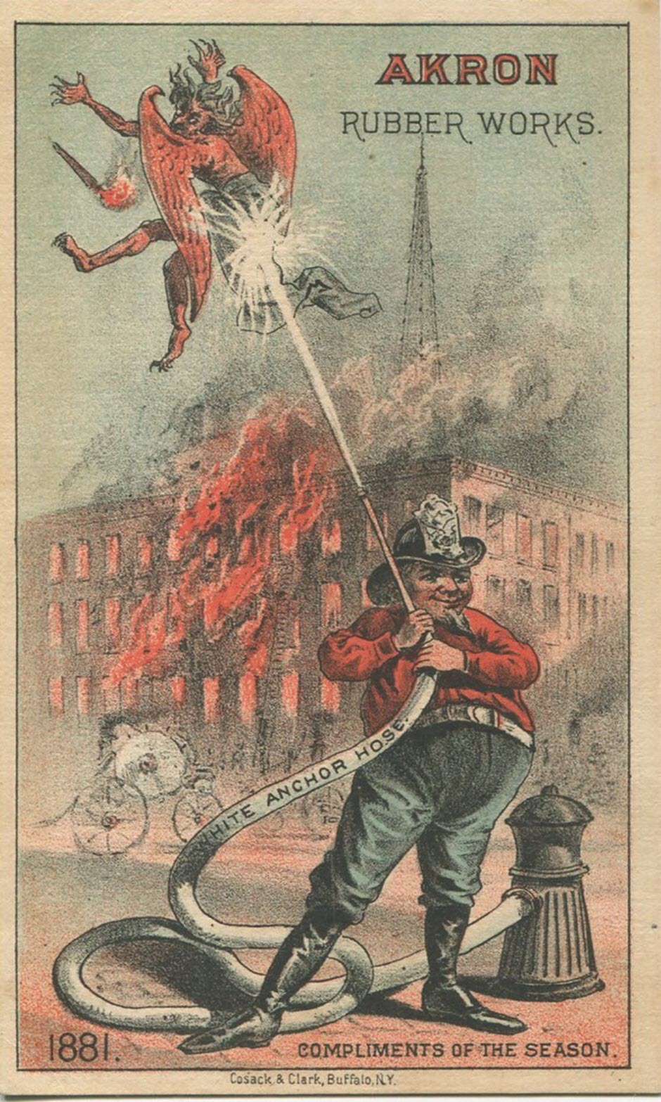
The Akron Rubber Works issued a series of new year’s cards featuring their White Anchor Hose. Whimsical rather than commercial in tone, this one features a jolly fireman startling a winged demon into dropping his flaming torch. The building engulfed in flames in the background is an odd touch for “Compliments of the Season.”

Seasons Greetings from Our Family to Yours

I want to look at three seasonal trade cards put out by 19th-century merchants. What I particularly like about these examples is that they include portraits of family members of the company founders. Like so many new businesses, these enterprises were family affairs and members of different generations worked to establish and perpetuate the firm. With these cards, it’s as though the men (and they are all men) in the inner sanctum have stepped forward to extend their holiday greetings and to remind you that they are also personally at your service throughout the year.

The first is a card from Ridley & Sons Department Store located in New York’s lower east side. (You can still see a portion of the original building at Orchard and Grand Streets. It’s painted bright pink!)

Ridley’s was founded in 1849 by an English immigrant, Edward Ridley Sr. Ridley was one of the first retailers to send his customers a catalog through the mail, allowing them to do their shopping from home. The store was also innovative in appealing to the lower east side’s large Jewish population by promoting Chanukah gift giving along with Christmas gifts during the holiday season.

Ridley’s was an affordable store with a wide clientele. This 1874 trade card describes an impressive variety of goods.

courtesy of: http://blog.insidetheapple.net/2009/08/e-ridley-sons-and-murder-of-edward.http://blog.insidetheapple.net/2009/08/e-ridley-sons-and-murder-of-edward.html

Variety and low prices made the store a success. In 1876, The New York Times observed:

What the inhabitants of the east side of the City would do without Ridley’s, is something of a question. The immense store … has become a sort of necessity to the people living anywhere within a couple of miles of it, the spectacle it presented on a Saturday night suggested the thought that half the City has come there to buy dry goods, toys, furs, furnishing goods, or some of the other numerous things with which this vast establishment is stored.

“Ridleys,” New York Times, December 11, 1876, page 3

Our card is inscribed on the front, “Compliments of Edward Ridley & Sons”. It includes no specific date or greeting, but shows a family gathered around an enormous tree bedecked with toys and lit tapers. It’s Christmas and this family is at home, enjoying a bounty of gifts. A sled marked “Edw’d Ridley & Sons” leans against one boy. Next to him, a girl outfitted in a fur-lined muff, coat, and hat admires a toy donkey on wheels. Mother, baby, children, and grandparents all interact, but one figure stands slightly apart, looking out at the viewer. It is one of Edward Ridley’s two sons, proffering a small book, probably the store’s famous catalog. By purchasing Ridley’s goods for your holiday, you are as good as inviting Mr. Ridley himself into your drawing room as part of the family.

The card is printed by Sackett, Wilhelms & Betzig, a New York lithographer in business between 1882 and 1889. Edward Ridley, Sr. died suddenly in 1883 and his sons took over the running of the store, so this card was printed some time between 1883 and 1889.

One other face stands out in the center of the image, the benevolent grandfather who has removed his spectacles while two grandchildren clamor for his attention. This may be a completely personal speculation, but he bears a striking resemblance to Edward Ridley, Sr., the founder who had so recently passed on. Could this be a reminder that Mr. Ridley, Sr., although gone, was also still with you in spirit at the holidays?

Edward Ridley, Sr.

The back of the card offers no further clues. It includes a sentimental poem, “Gran’ma Al’us Does”, written in mock childish tongue, and a declaration that goods will be delivered free of charge to any of 25 different neighborhoods in New York and New Jersey.

The story of the Ridley sons, Edward Jr. and Arthur, ends on a macabre note. They continued to run the store until it closed in 1901. The brothers then parted ways and went into real estate. Edward operated his firm out of a basement in the original department store building. In 1931, Edward’s secretary of 51 years was found murdered at his desk. Two years later both Edward, age 88, and his assistant were found slain in the same basement room. The New York Times headline read, “Wealthy Eccentric Beaten to Death, his Secretary Shot, in Sub-basement Office”. None of the gruesome murders were ever solved.

I wonder if the gentleman meeting our eyes so calmly from beside the Christmas tree is Arthur or the ill-fated Edward Ridley, Jr..

An 1882 New Year’s greeting from Charles Wendell’s Sons, a Chicago wholesale jeweler, shows full-figure portraits of Emanuel V. and Maurice Wendell standing on top of a safe, its doors flung open to reveal their names. Arrayed around them, four representatives dressed for different climates pull cases of the firm’s goods to far-flung regions. The card is printed by Shober & Carqueville (1877-1895), one of Chicago’s largest lithographic firms.

Founder Charles Wendell had died three years earlier, leaving the company in the care of his sons. His obituary in the Chicago Daily Tribune, dated October 18, 1879, read:

Mr. Wendell was a Russian by birth, having been born in Riga, the capital city of Livonia, in 1832. He came to America at the age of about 17, and to Chicago in 1860, where he engaged in the jewelry business, which he followed with unvarying success until, at the time of his death, he had established one of the largest and most prosperous wholesale houses in the city in that branch of trade. A man of strict and unswerving integrity, he stood high in the commercial world, while the social connection of himself and family was of the very best. A wife and seven children are left to mourn a loving husband and father, and a large circle of friends will sympathize with them in their great affliction.

The greeting reads, “Charles Wendell’s wish you a Happy New Year”, with the image of the two men standing in, rebus-like for the word, “Sons”, just below their father’s name.

On the reverse is a greeting addressed “To the Trade”: “With the New Year, the Boys greet you as one firm again.” It refers to “a year of separation”. From 1879 until 1881, the firm had been known as “Charles Wendell & Sons”. The death of its founder must have been the cause of some friction between the brothers over the following years. In 1881, they took a year to, as the card relates, gain “wisdom, friends, and trade” and subsequently “united their interests” under the revised name. Following a gap in services, this card must have been a necessary and strategic marketing tool. A personal outreach to retailers, the brothers wish them an “uninterrupted year of prosperity” and declare, “to secure happiness, deal with the popular and successful firm of Charles Wendell’s Sons”.

Retailers would have been familiar with the elder Charles’ “Boys”. It’s possible that the “four gentlemanly representatives on the road” pictured on the front of the card are also individual portraits. The regional rep was the face that most clients knew. This elegant greeting card tells the story of another family firm in transition and the crucial work of maintaining customer ties after the passing of the founding generation.

I include a third card, an 1869 New Year’s greeting, because it is charming, early and something of a mystery.

The dealer listed this as a “political” card and it’s clear to see why. The five figures are all caricatures in the spirit of Harper’s Weekly or Puck and there is a comic, “editorial” quality to the small text. Aside from the greeting, there’s a heading that reads, “Executive Committee of the German”, the last two words framed by European style quotation marks. The back is blank.

Our first clue is the small inscription “Cobb, Pritchard & Co.”, which appears on the left-most pedestal. Cobb, Pritchard & Co. was a Chicago bookstore and publisher in business between 1864 and 1871. It was founded by Junius Brutus Cobb, one of a group of siblings having Roman names, (the others were Lucius Marcius, Cassius Caius, Marcia Lucia, Lucia Marcia and, oddly, Daniel). The family originated in Cleveland where three of the bothers had founded the bookstore, Cobb, Andrews & Co., in business from 1852 to 1888.

An 1866 ad in the Chicago Tribune reads:

An obituary in Publishers Weekly, dated December 28, 1912, fills in more of the story.

Daniel Pritchard, for many years associated with D. Appleton & Co. died at the home of his daughter, Mrs. Talmage W. Forster, East Orange, New Jersey, on Saturday, December 21 after a brief illness. He was born in Glasgow, Scotland in 1835 and came to the US with his parents at an early age. He began business in Cobb’s book store, Mansfield, Ohio and in course of time removed to Cleveland with Cobb Brothers, afterwards the famous firm of Cobb, Andrew & Co., both of whom were near relatives of his. In the later sixties he moved to Chicago where he founded with his partners the book jobbing house of Cobb, Pritchard & Co. Unfortunately, the great fire of 1871 wiped them out of business and Mr. Pritchard at once came east…

Although the Chicago store was only in business for seven years before the great Chicago fire, its impact on some of Chicago’s major institutions was immense. Cobb, Pritchard & Co. helped to start the extraordinary book collection of Edward Everett Ayer, first president of Chicago’s Field Museum of Natural History and instrumental to its founding. Ayer wrote that in his early 20s, he visited the Cobb and Pritchard Book Store in search of a copy of Prescott’s “Conquest of Mexico”, the book that had first sparked his interest in history. Ayer, just one month back from the war told them that he could not afford the enormous price of $17.50 for the 3-volume work, and offered to purchase the first volume, paying for it in installments of $3.50. The proprietor, obviously impressed with the young man, offered him all three volumes for a total of $3.50. Ayer described these as “the three most valuable books in the world” and on his death, his collection passed to the Newberry Library, of which he was a charter Trustee. The editor of the Newberry Library Bulletin, in a December 1950 introduction to Ayer’s account of purchasing his first book, writes:

Julius B. Cobb and Daniel Pritchard’s Book Store … does not, of course, appear in any of the histories of Chicago. Yet everyone who knows and has used the collection which they helped to start will, like Mr. Ayer, bless them both. Without them he might never, as he admits, have found out what fun reading history could be.

But back to our card. The five figures are arranged in a hierarchy, each one named and labeled. E.J. Cobb (Invitation) seated at a desk and brandishing said invitation, is our next clue. Rather than a greeting card, this may have been an invitation to a new year’s celebration, and its recipients were either members of the firm or colleagues and clients who knew them personally. With the firm name written at such a tiny size, one would have had to recognize the portraits. As the Cobbs, Andrews and Pritchards all seem to have been related, E.J. Cobb and A.H. Andrews are clearly members of the “family.” And the illustration, somewhat crudely drawn and probably a home-made affair, appears to be full of inside jokes.

Maybe E.J. Cobb with his quill on his desk was the card’s draftsman. He holds a scroll with the header, “Program”

  1. Speech a la Grant – Gen’l Cobb
  2. Solo on a teapot – Count Andrews
  3. Would I were a small Boy Again – Baron Bryson
American Hash – OR Collins

A.H. Andrews (Music), brandishing a violin and with a triangle dangling at his waist, holds a sheet with the words, “Overture to “We Won’t Go Home till Morning” by Champagne Charlie”. Champagne Charlie, a popular British music hall paean to a life of idleness and excess, premiered in 1866. Clearly, these partygoers will not be watching the clock.

W.C. Egan (Hall) holds a ring of keys and a cleaning brush. He is in charge of the facilities.

W.J. Bryson (Finances) is the central and largest figure, perched atop the strongbox. Is he cringing as he regards his boss, Mr. Cobb? The keeper of the funds looms large in the importance of any business. It is he who will recite, “Would I were a small boy again”.

The last figure is I.S. Collins (Commissary), who sharpens his knife as the chickens step up to be slaughtered. Behind him on the wall is the “Menu: Italian Salad a la Army Reunion.” Mr. Collins must have been a civil war veteran and he will present the “American Hash”.

Just below Mr. Bryson’s left knee, there is another name, C. v Hafften, Sec. — another member of the firm? Or is this a joke directed by and at the artist. Carl von Hafften was a mid-19th-century German painter whose work was popular with American collectors (although he mostly painted romantic seascapes). We may never know. Nor have I been able to turn up any explanation for the phrase, Executive Committee of “The German”.

We may not know exactly for whom this charming New Year’s card was intended. Its jokes may be lost to history. But we can be certain that, before the great Chicago fire put them out of business, Messrs. Cobb & Pritchett, who had a sense of whimsy and who were so kindly inclined toward a young book lover, left a lasting mark on their city.