
TJ Lyons, Boston’s Old-Timey Printer

From 1924 until his death in 1986, in his 93rd year, Thomas J. Lyons (“TJ”) was a collector of vintage wood and metal type fonts who designed and printed using those fonts. Considered a lovable, energetic, colorful Boston character, TJ loved to put multiple typefaces together in an “old-timey” kind of way. His design was rarely particularly sophisticated, and his presswork would not be characterized as fine printing, but he had a lively, witty, downright fun style. In addition, TJ helped many an area designer or advertiser with type selection and made his many fonts available. I used a bit of his type now and then, and greatly enjoyed my 2-3 visits to TJ’s place.
In an era that generally scorned ornate and eccentric 19th-century typefaces, TJ loved them. He was an early leader in the revival of antique typefaces. TJ had been a Linotype operator, then an Army soldier in WWI. He lived an interesting and eventful life, best captured in Al Gowan’s book, “TJ Lyons, A Biography and Critical Essay” (1987, Society of Printers, Boston).
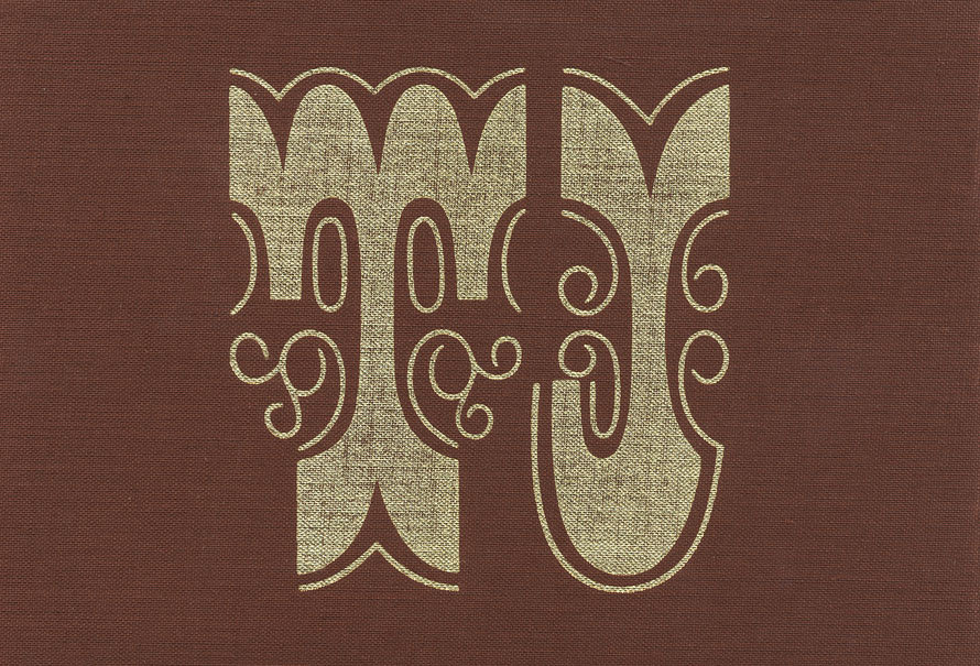
Stamped on the cover of Al Gowan’s book.
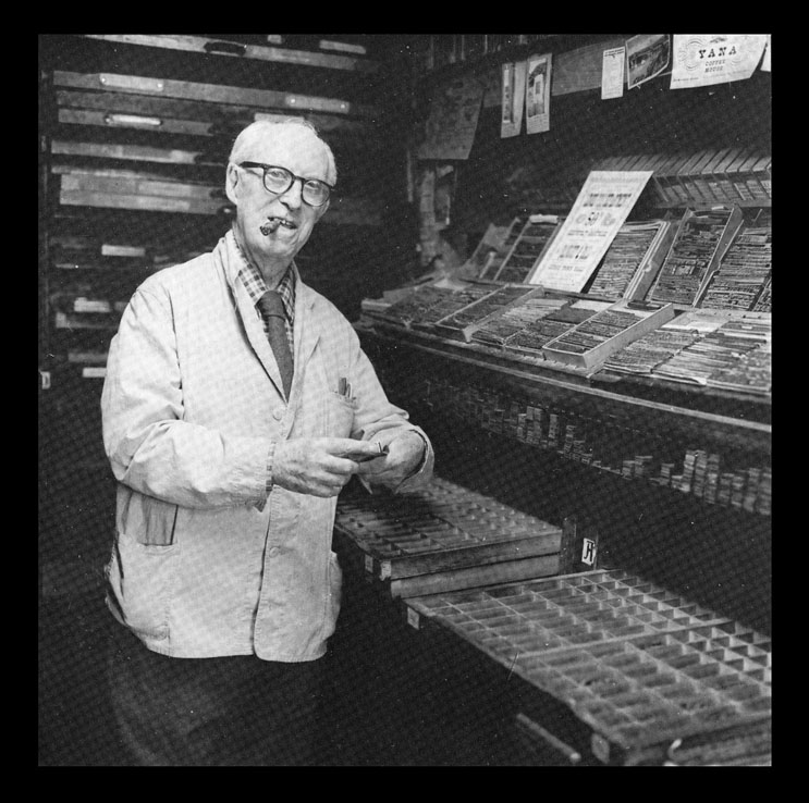
TJ on the job in 1984, at age 90. (Michael Romanos photograph)
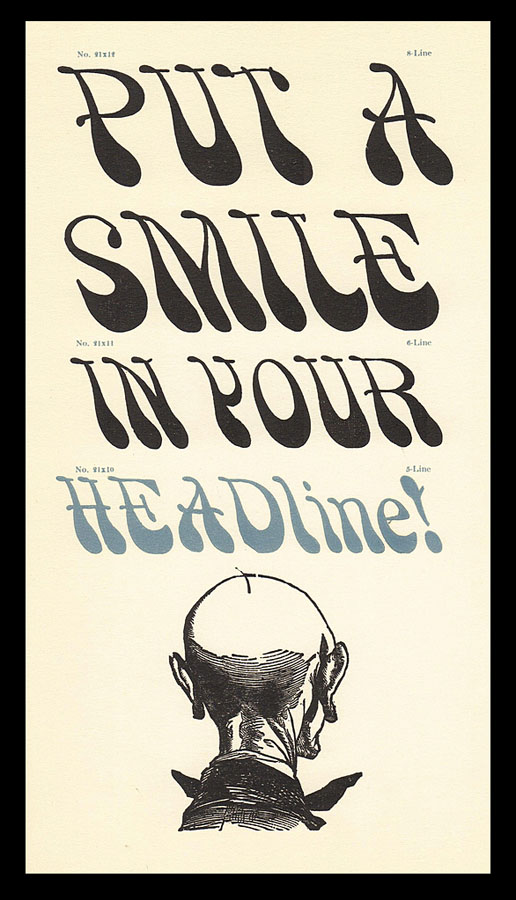
One panel of a TJ brochure.
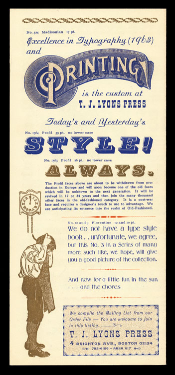
A panel of another TJ brochure.
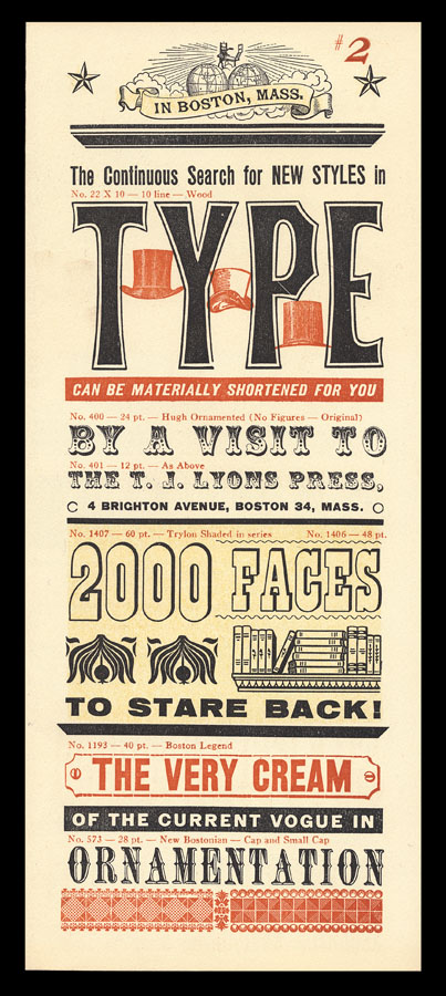
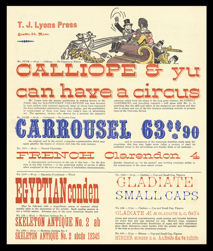
A type specimen page.
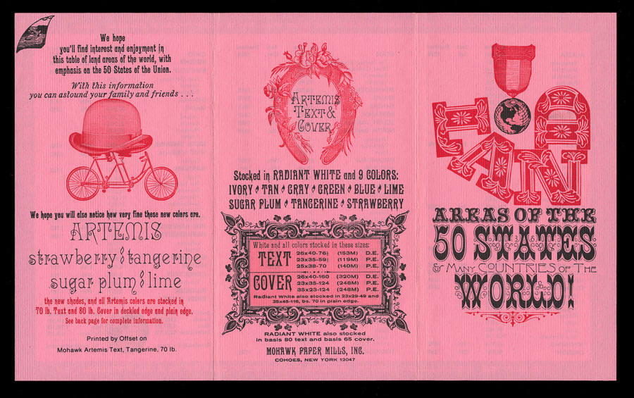
One side of a 6-panel brochure.
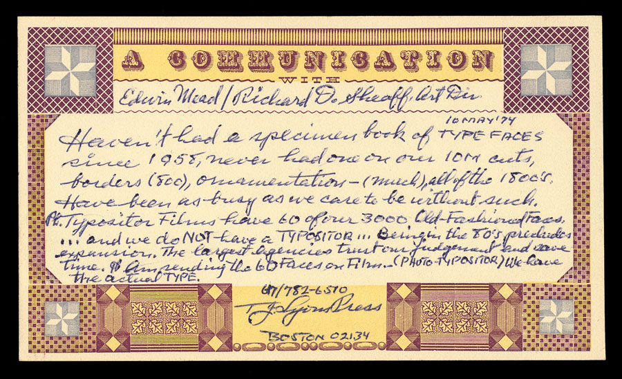
A 1974 note to me from TJ.
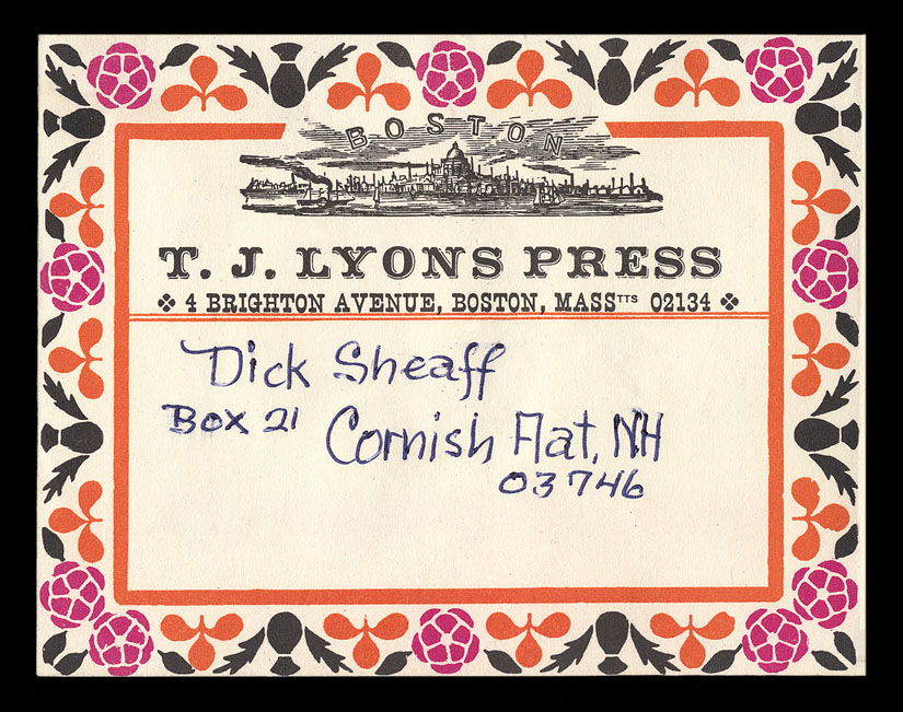
Shipping label.
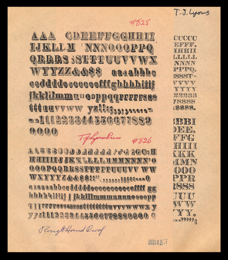
A couple of pages of type showing, in rough proof.
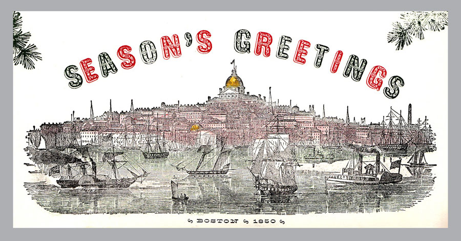
Christmas Card, 1950.
The Boston Harbor scene was taken
from the masthead of Gleason’s Pictorial.
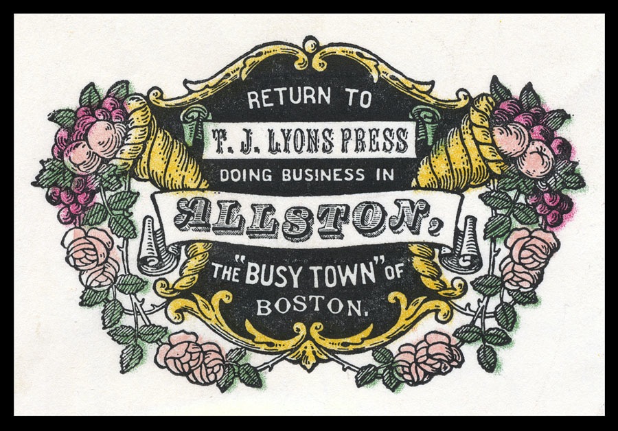
Envelope corner card.
Printed by TJ.
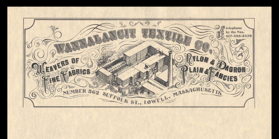
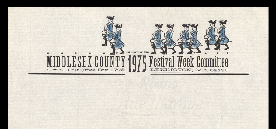
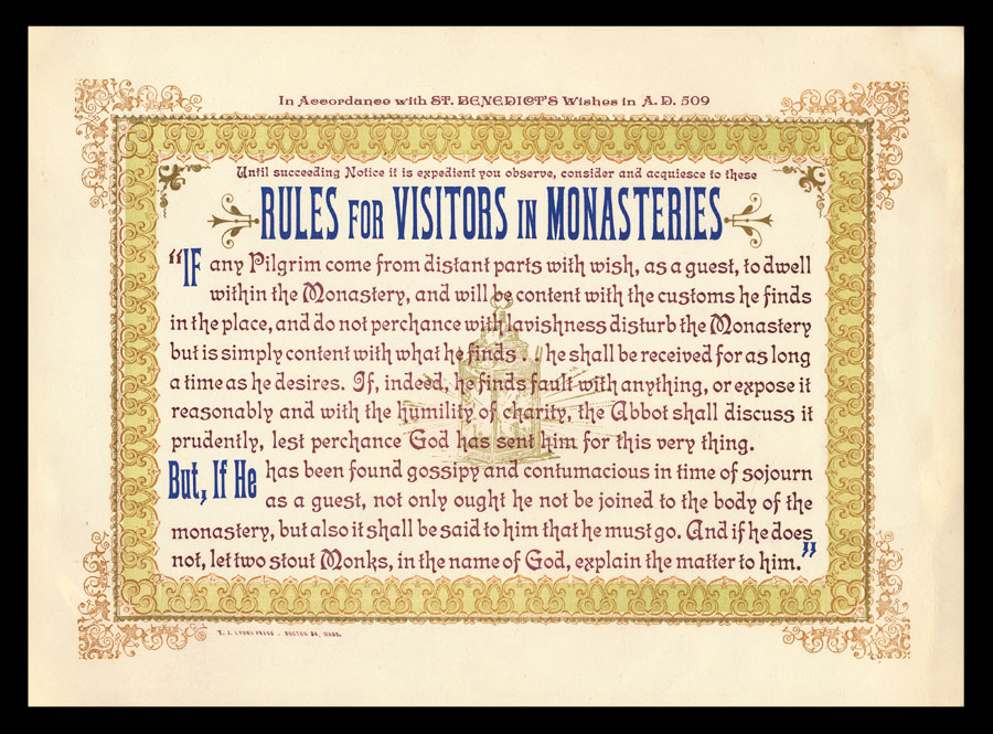
Two of TJ’s letterhead designs for Boston-area clients.
Inside spread of a Lyons’ promo folder.
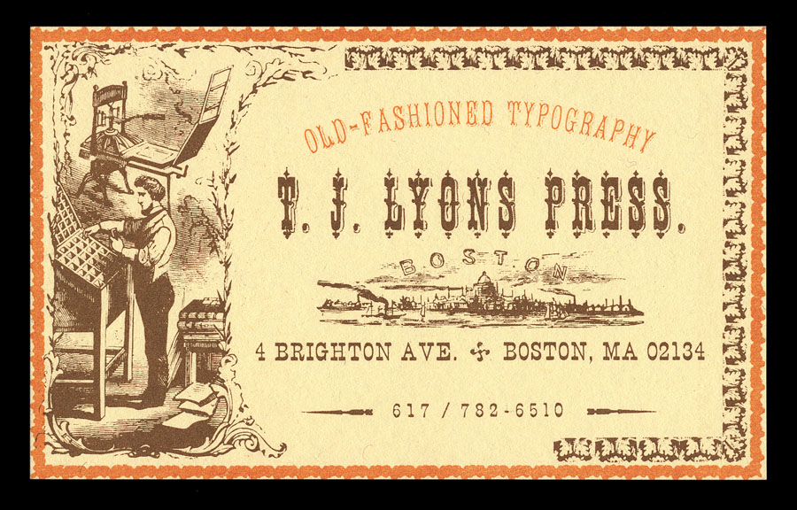
Business card.
Online searches will reward the interested with more examples of TJ’s work. A great place to start would be David Greer’s postings on Flickr at: