A Whiter Shade of Pale
Richard Sheaff
On printed materials where the “color” white is seen, 99.9% of the time it is simply the white of the paper stock being allowed to show. It is unusual and rarely seen that white ink is used, printed on a colored stock. That has always interested me, and in my career as a graphic designer I sometime explored the technique. These days, as a collector, I keep an eye out for examples.
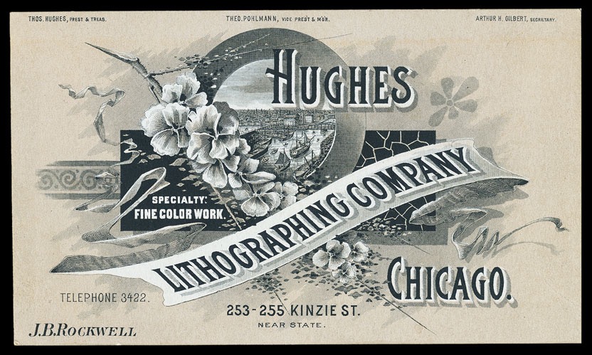
This trade card exhibits the typical manner of printing, where the color of the white paper stock was allowed to show through the tan and black areas, in some places.

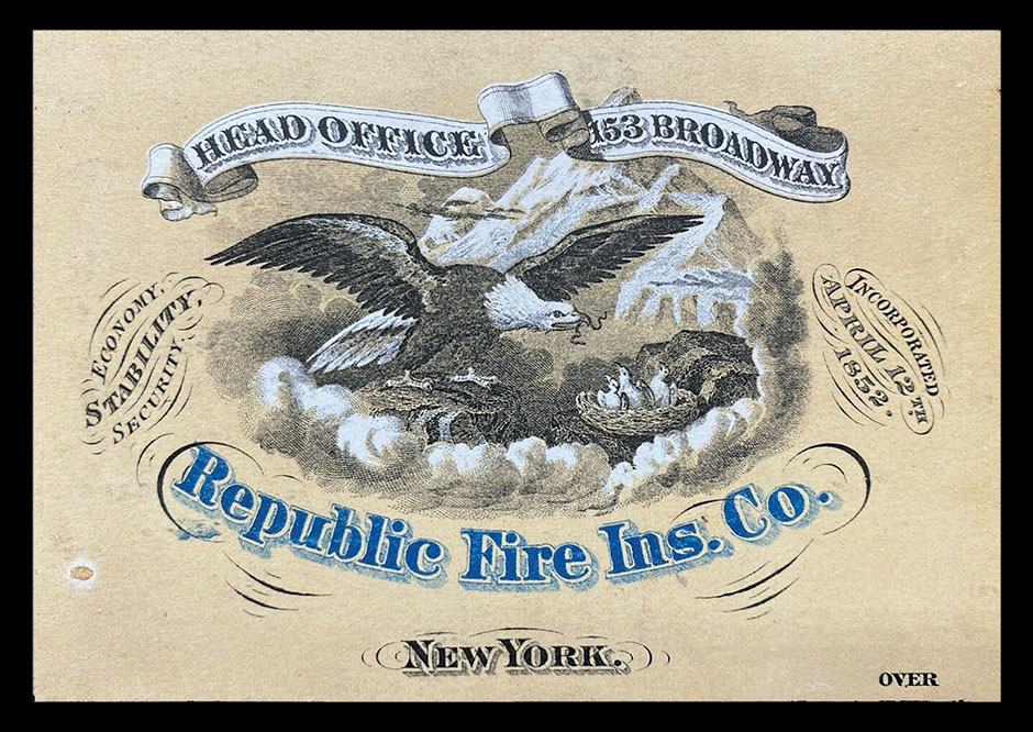
Bright white ink used against a tan ink. The actual paper stock, observable on the back, has aged to a yellowish off-white, making clear that that a white ink has been used on the front.
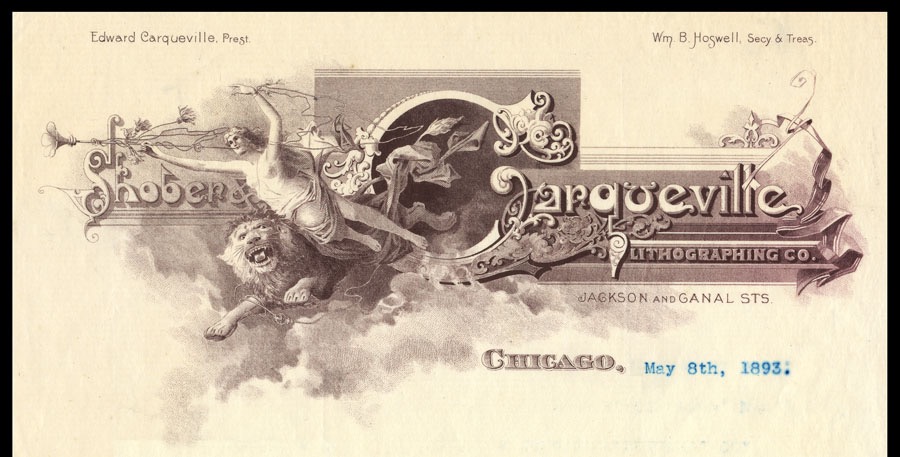
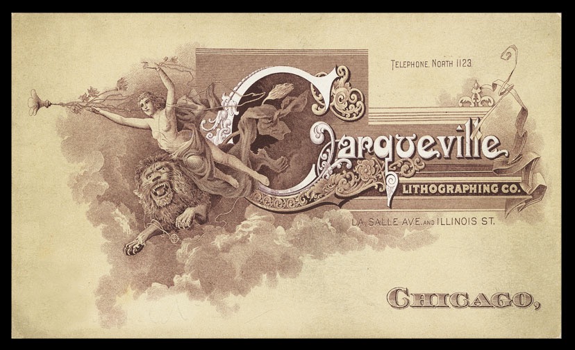
Two Shober & Carqueville letterheads which show printing without added white ink (above)(Shober & Carqueville was the company name between 1877-1895) and with added white ink (right)(Carqueville was the company’s name from 1896-1916). Details in brown ink were printed on top of the white in places.
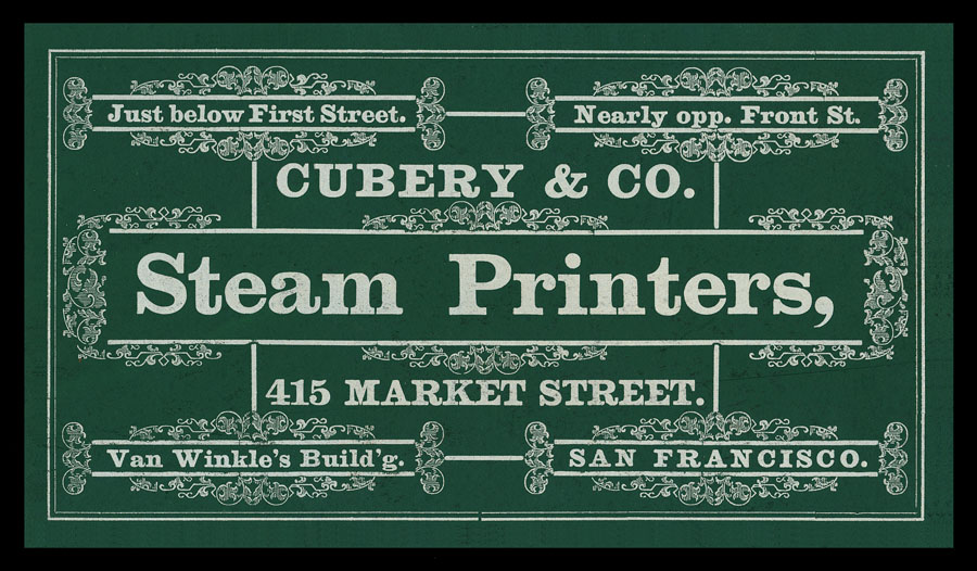
An opaque white ink on green card stock.
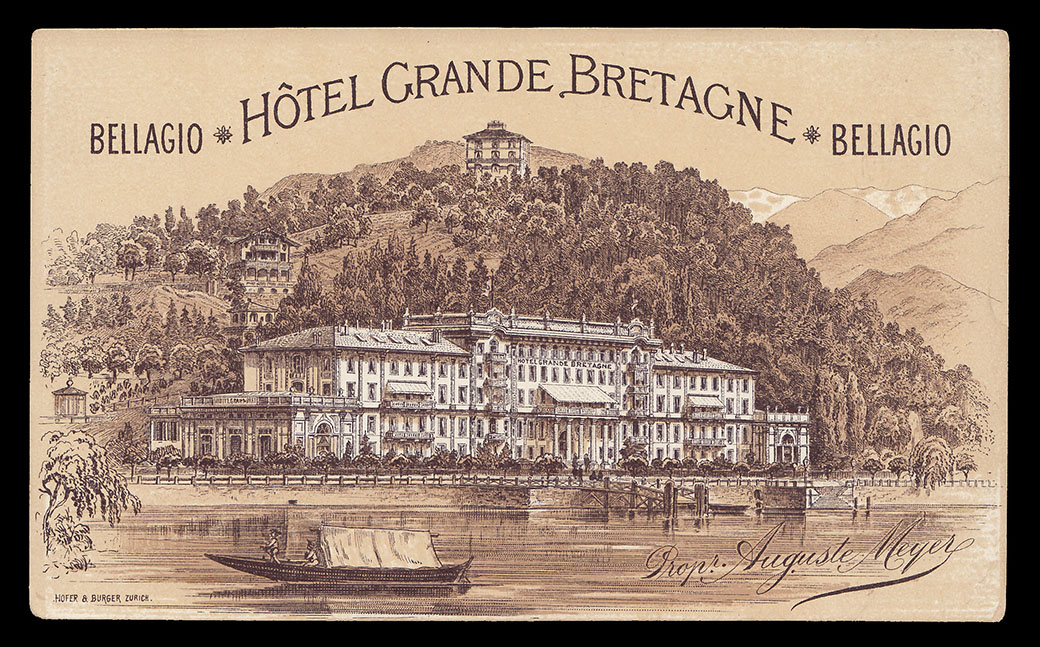
An example on an Italian trade card for the Hotel Grande Bretagne on Lake Como in the Lombardy region.

A lithographed greeting card which includes areas of white ink printed on the tan card stock.

A steel engraved greeting card with a heavy overlay of white engraving ink to simulate snow.

A silkscreened greeting card with white ink printed on the tan card stock.

On a design project for a paper company that manufactured colored, uncoated papers, I showed examples of various ways to use such soft, uncoated papers in unexpected ways. This commissioned chef image uses an opaque white ink to give life to an image printed on tan paper.
